These maps illustrate some very interesting other ways of viewing the world and you never knew you needed.
Click the green cross in the top right corner of the picture to see it full size.
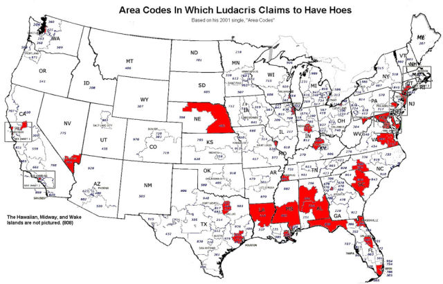
This map shows every area code in which Ludacris has "hoes":
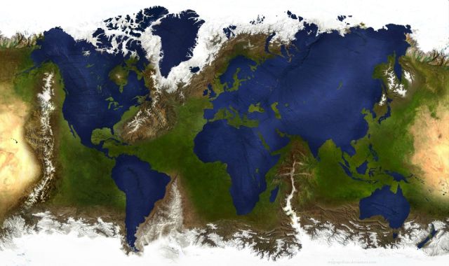
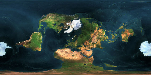
This is what the world would look like if the water and land masses were inverted:
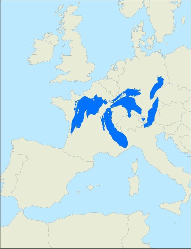
This is how much space the Great Lakes would take up if they were in Europe:
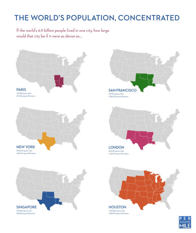
Here's how much space the world's population would take up if everyone lived in one city:
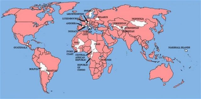
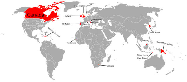
This is a map of every country England has ever invaded:
This map shows the population density in the United States by decade:
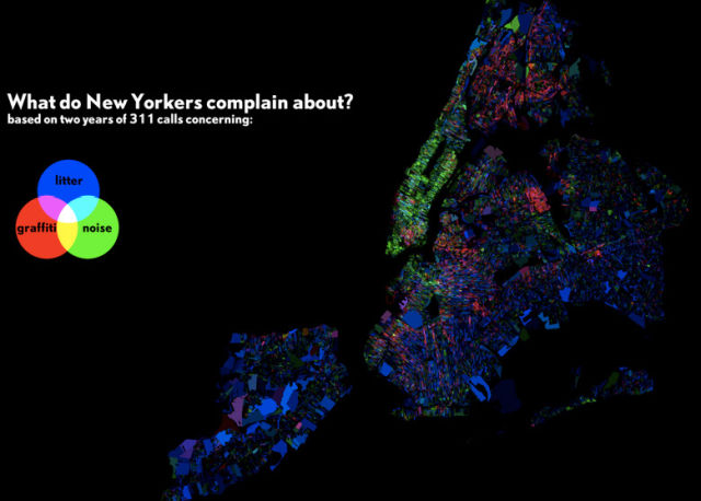
Here's a map of everything New Yorkers call 311 to complain about most:
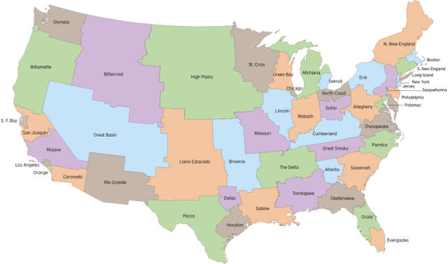
This is what the U.S. might look like if state borders were redrawn to evenly distribute the population:
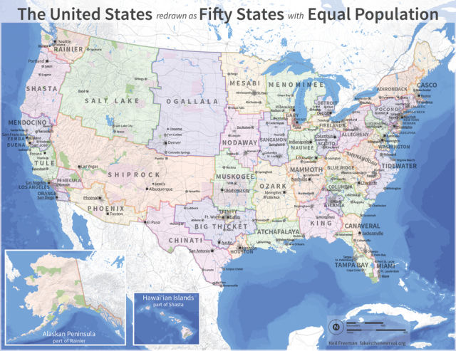
Here's another stab at the concept:
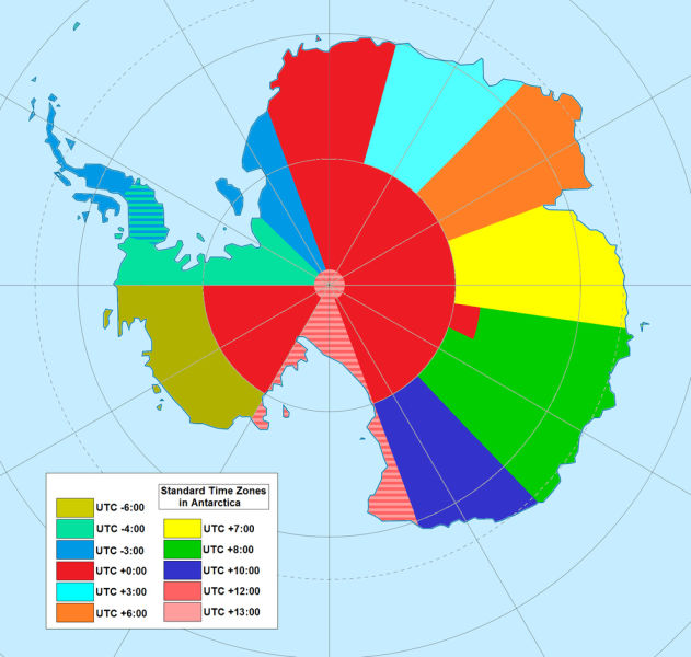
Ever wonder what time zones look like in Antarctica? Here's your answer:
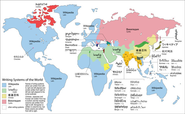
A guide to the writing system of the world:
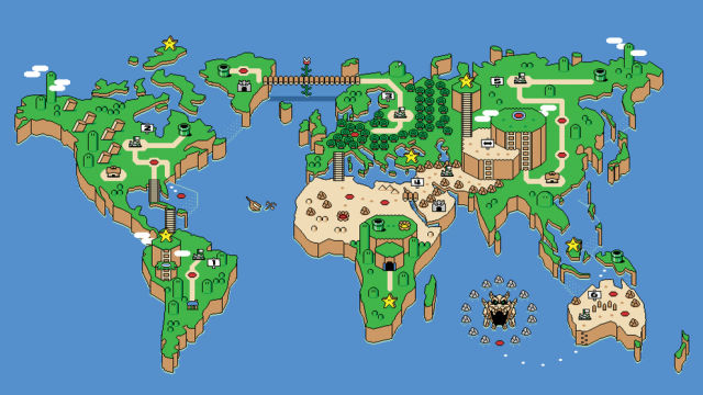
A Super Mario Bros. take on the world map:
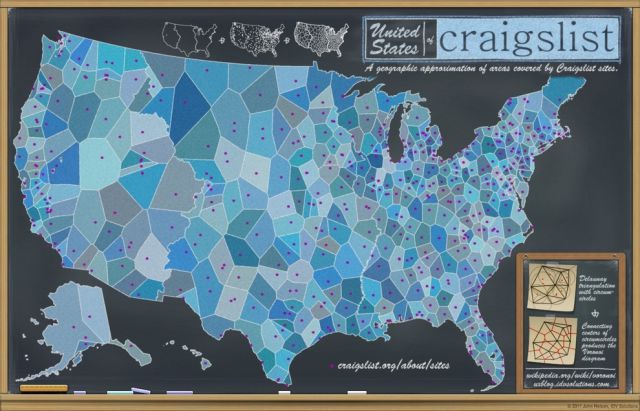
The U.S. according to which cities have their own Craigslist section:
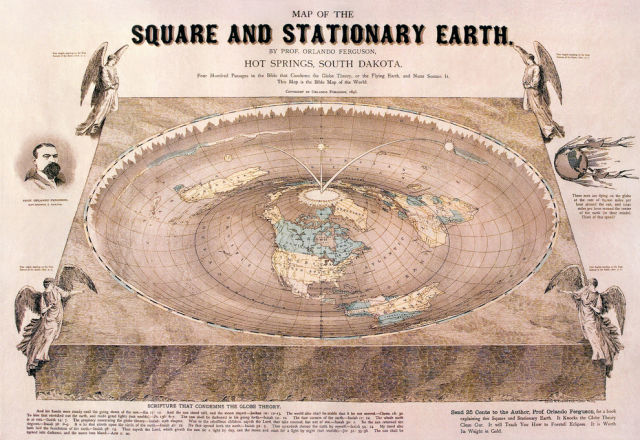
Here's what the world might look like if it weren't spherical:
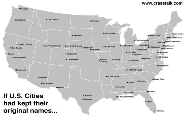
A map of the U.S. with the original city names:
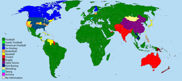
A guide to the popularity of various sports around the world:
This map uses a different center point than you're used to:
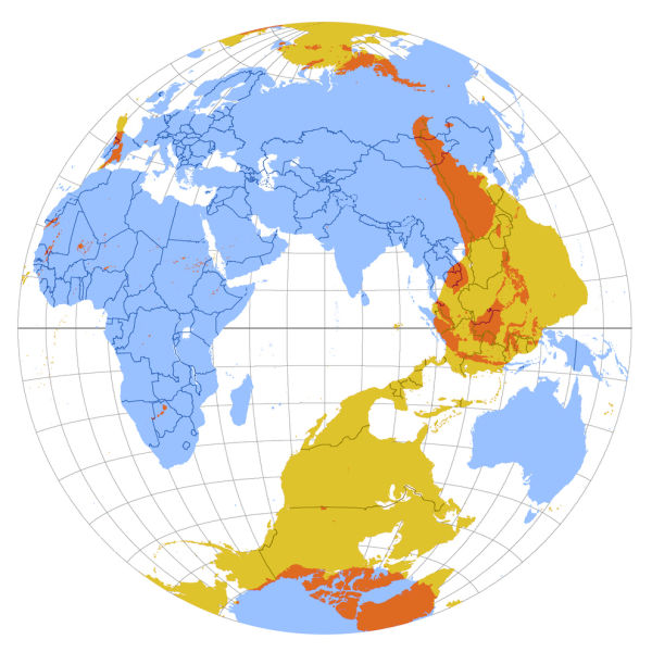
A map showing what's on the exact opposite side of the planet:
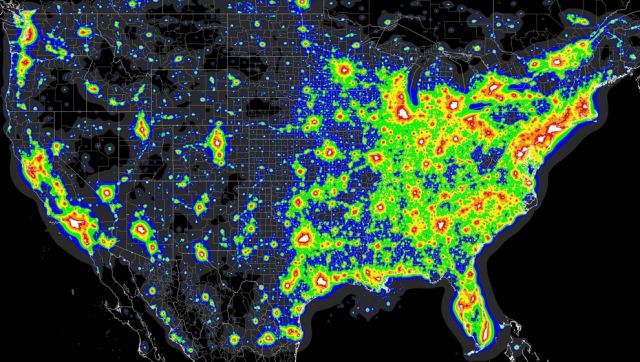
A map of the worst light pollution in the U.S.:
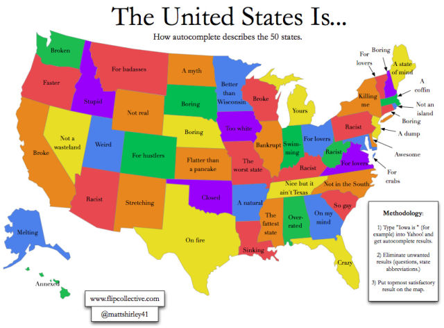
Here's how Google auto-complete describes all 50 states:
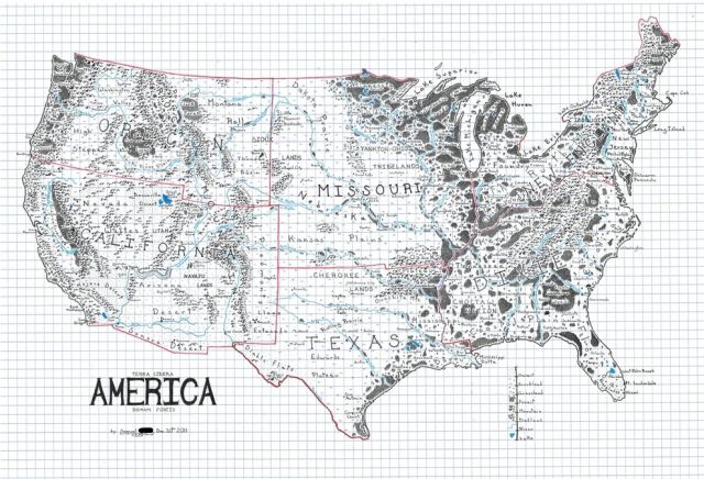
The U.S. drawn like a map from a fantasy novel:
The U.S. high-speed rail system that will never be:
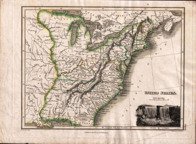
An America that almost was from 1814:
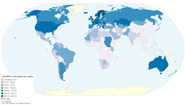
A map of the countries that consume the most milk:
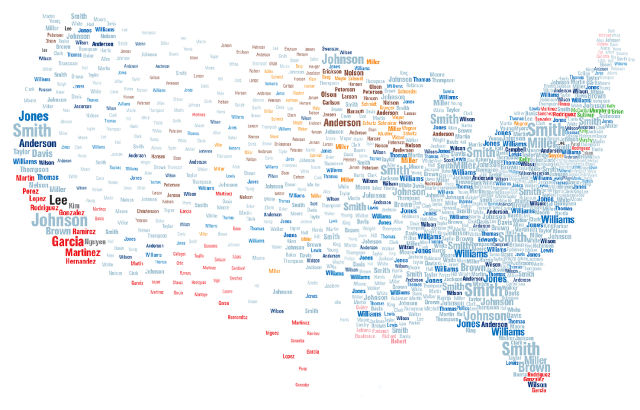
A map of the most popular surnames in the U.S.:
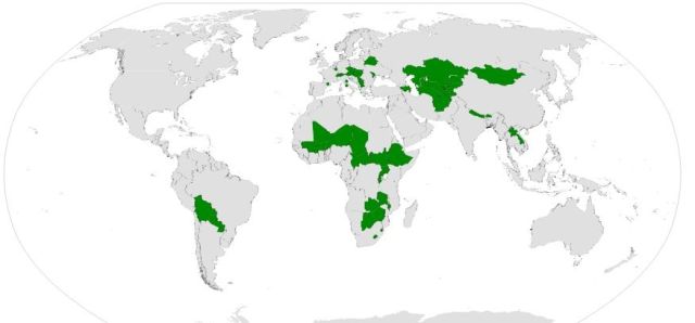
Here are all the landlocked countries of the world:
All the countries that share just one border with another country:
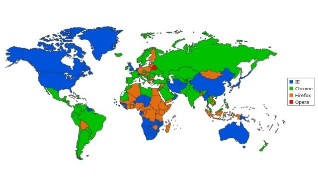
The most popular web browsers by country:
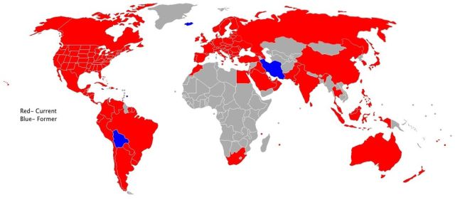
Here's every country with a McDonald's:
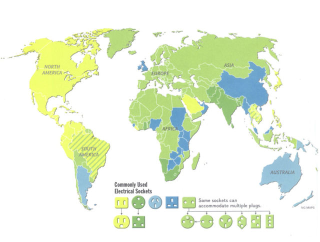
The world according to power outlets:
How the world looked during the last ice age:
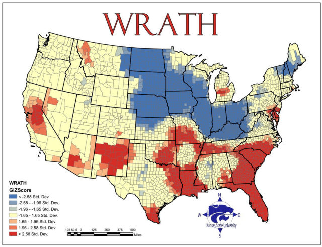
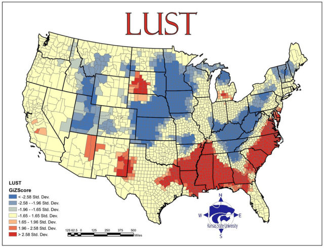
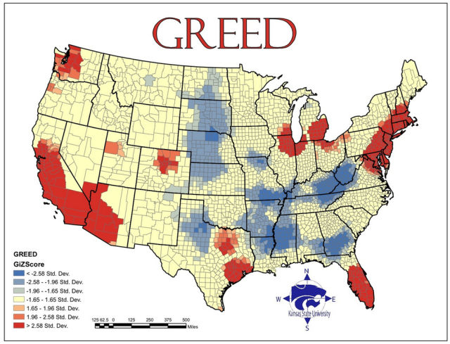
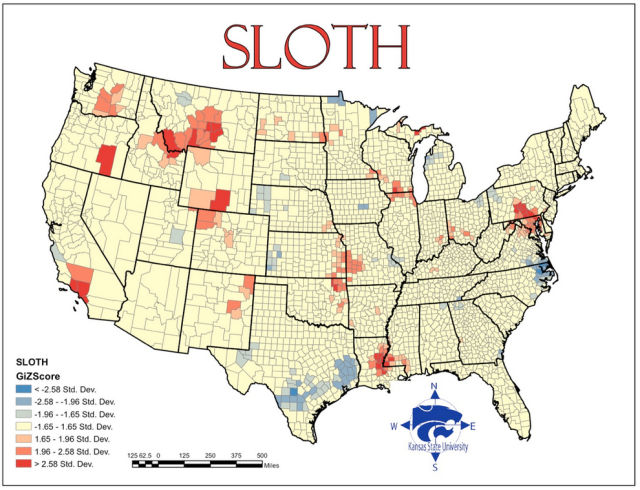
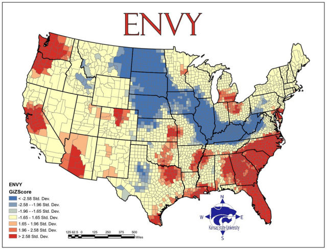
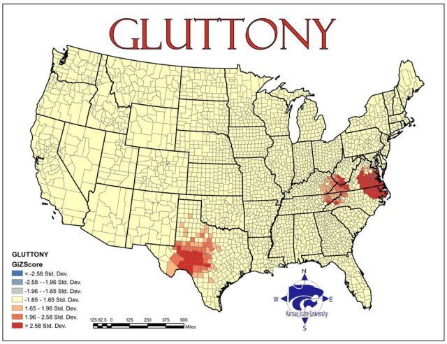
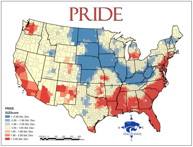
Maps of the U.S. according to how often the Seven Deadly Sins are committed:



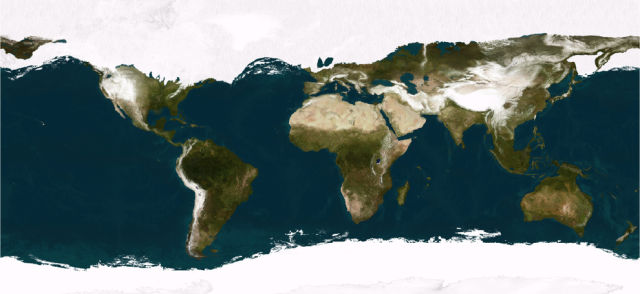

But #31 only shows the maximum ice cover and more dry land. Sahara was green at this time, middle east was greener, Amazon rain forest was grassland and so on.
#11 and #30 is useful :)