Gold medals are always different for each Olympiad. Their design is influenced by the trends of the time and the host country. But some motifs have a tendency to reappear every now and then though. Here is how the gold medals looked like at every Summer Olympics.
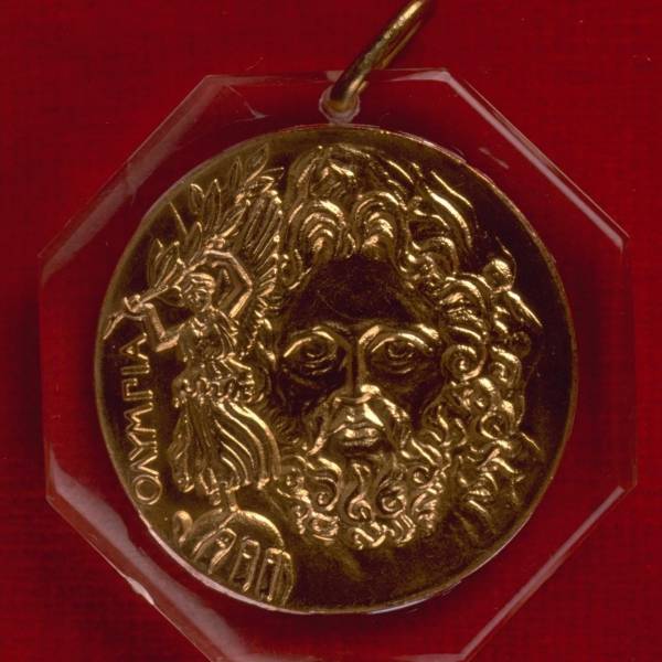
ATHENS 1896: Winners at the first Olympics of the modern era received a silver medal. The front of the medal depicts the Greek god Zeus' face, and he's holding a globe with the goddess of victory Nike on it.
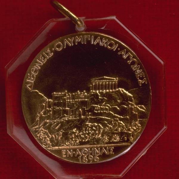
The back depicts the Acropolis, an iconic Athenian ruin.
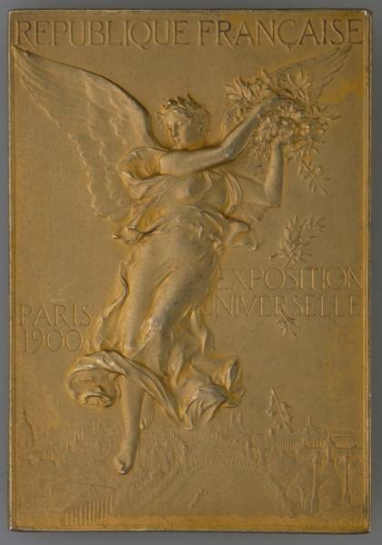
PARIS 1900: The medals at the second modern games are the only ones that are rectangular instead of round. The front shows a winged goddess flying over the city of Paris.
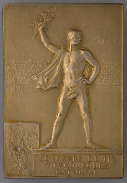
The reverse of the medal shows a victorious athlete, with the Acropolis faintly visible in the background beyond the stadium.
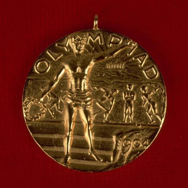
ST. LOUIS 1904: The obverse shows a triumphant athlete in front of a bas relief illustrating the classic sports from Antiquity.
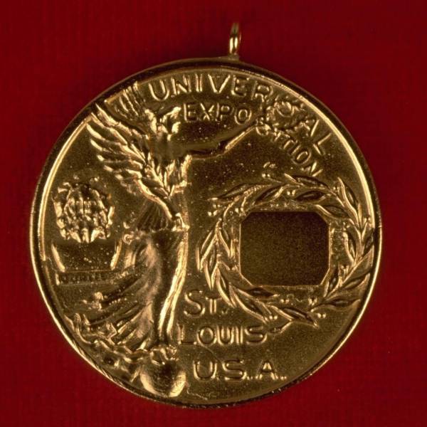
The reverse shows the goddess Nike (a very common figure on these medals) standing atop a globe. There's a blank space where the event and place were meant to be filled in.
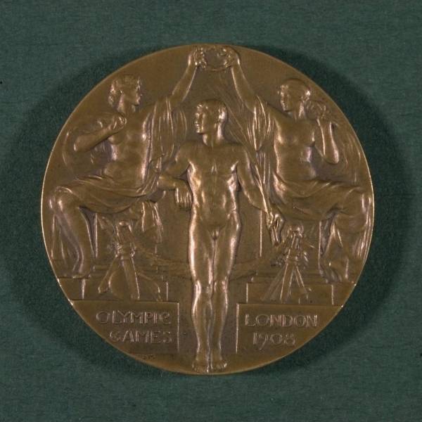
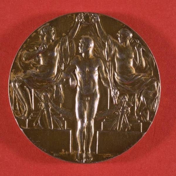
LONDON 1908: Two women place a laurel crown on the head of a victor.
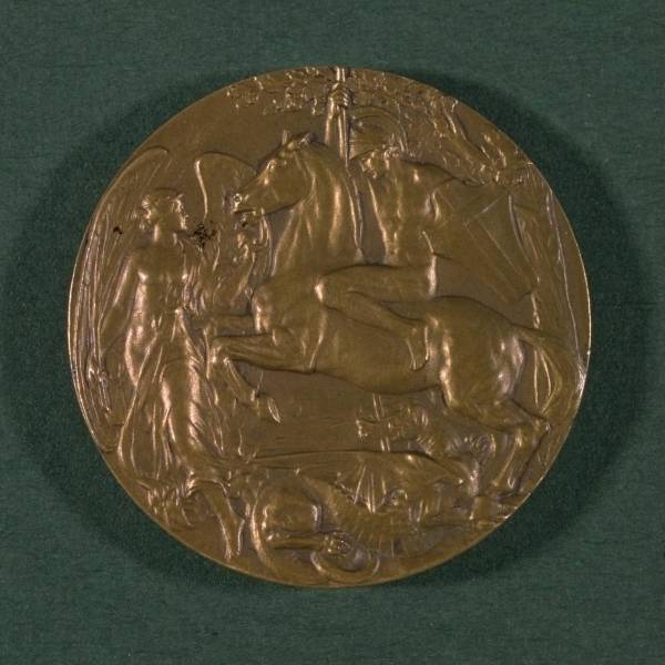
The back depicts St. George, patron saint of England who slew a dragon, according to legend.
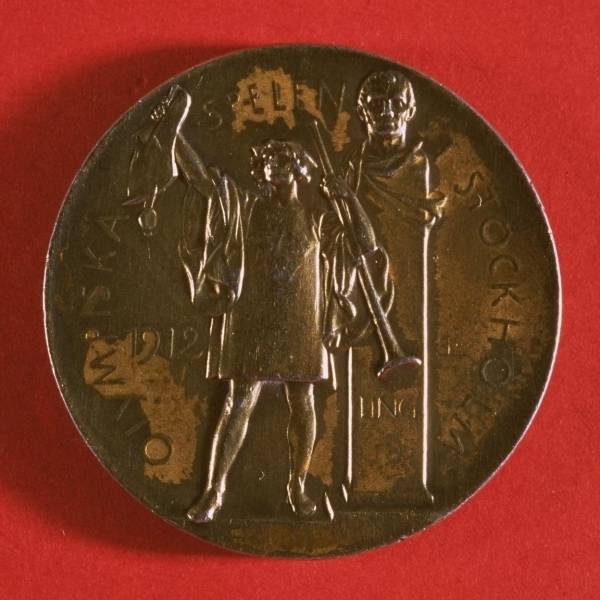
STOCKHOLM 1912: The front of the 1912 medals is the same design as the previous Olympics'.
The reverse shows a herald proclaiming the opening of the games in front of a statue of Pehr Henrik Ling, who pioneered Sweden's physical-education system.
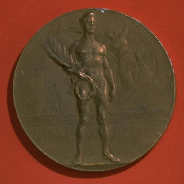
ANTWERP 1920: The obverse shows a nude athlete holding the spoils of victory in front of a Greek motif.
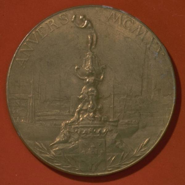
The reverse depicts the Antwerp monument, which tells the city's founding myth. The Roman soldier Silvius Brabo is depicted throwing the severed hand of the evil giant Druoon Antigoon into the river after slaying him.
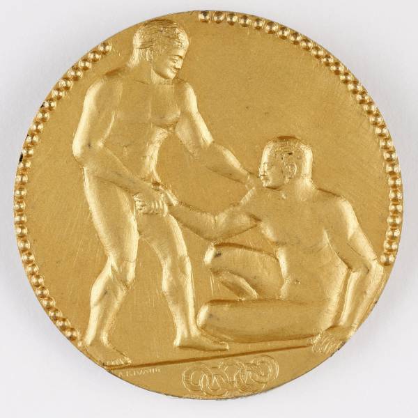
PARIS 1924: The front shows a victorious athlete extending a hand to help his rival up from the ground in a show of good sportsmanship.
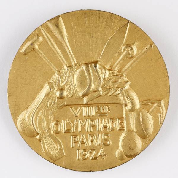
The back depicts an arch made out of various pieces of sports equipment as well as a harp, which signifies the cultural portion of the games.
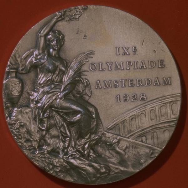
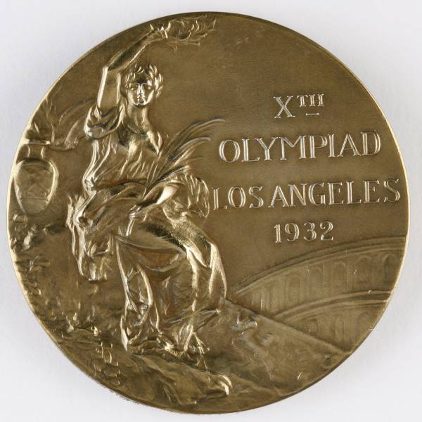
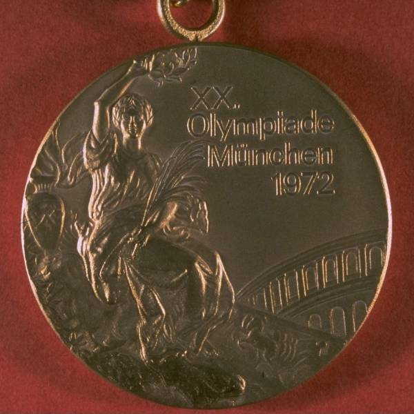
AMSTERDAM 1928: The design, which depicts the goddess of victory Nike holding a winner's laurel crown and a palm was created by Florentine artist Giuseppe Cassioli following an international competition from the Olympic committee in 1921. The design would be used on the obverse of many medals to come.
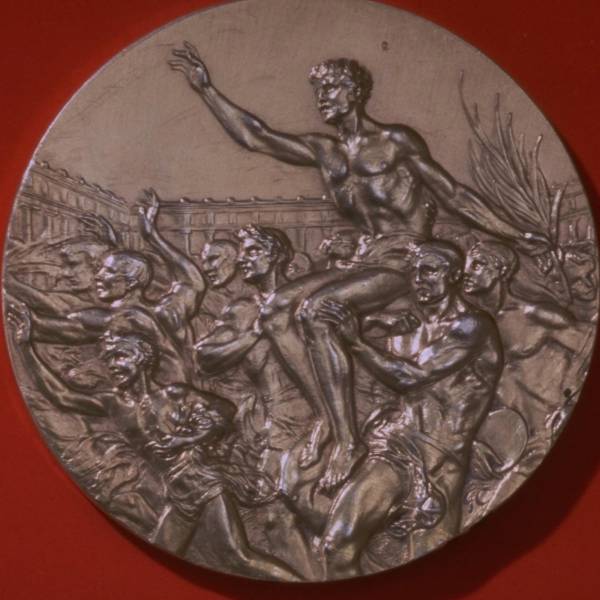
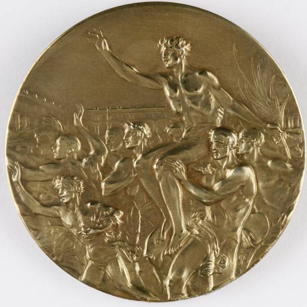
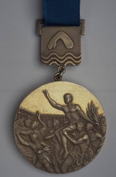
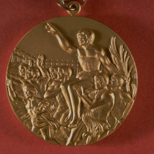
The reverse shows a champion being carried out of the Olympic stadium by a crowd.
LOS ANGELES 1932: The 1932 Olympics used the same medal design as the previous games.
The reverse of the medal was also the same.
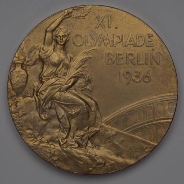
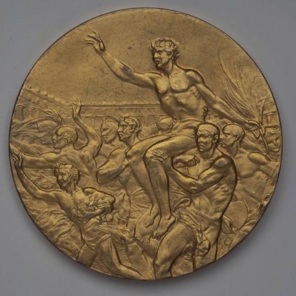
BERLIN 1936: There was a lengthy period of time where the Olympics used the same medal design for every games.
Front and back.
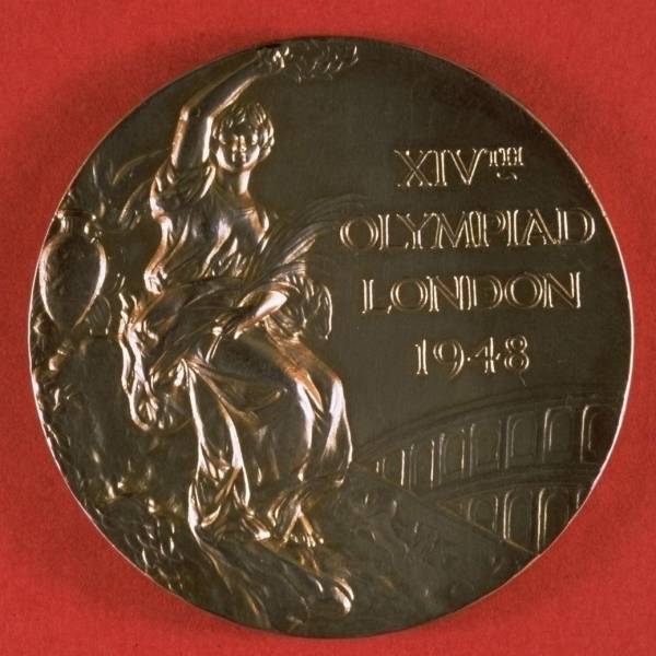
LONDON 1948: When the Olympics were held again after two games were canceled due to World War II, they once again used the same design.
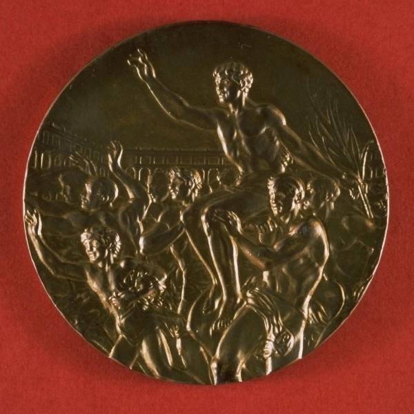
The reverse was the same too. But, hey, a return to normalcy ain't all bad.
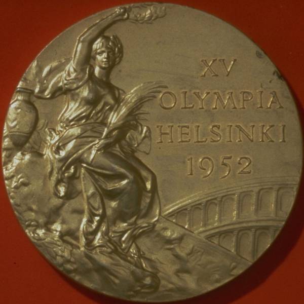
HELSINKI 1952: Nike again.
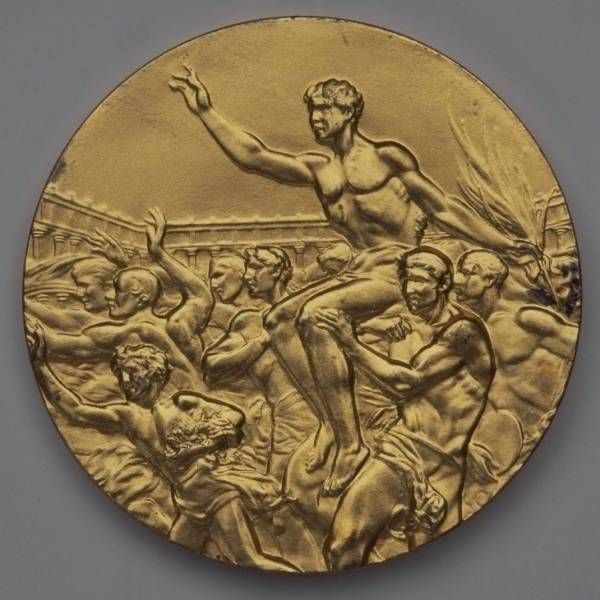
And a champ being carried by a crowd on the back again.
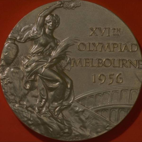
MELBOURNE 1956: The same design again. We promise they start switching them up again soon.
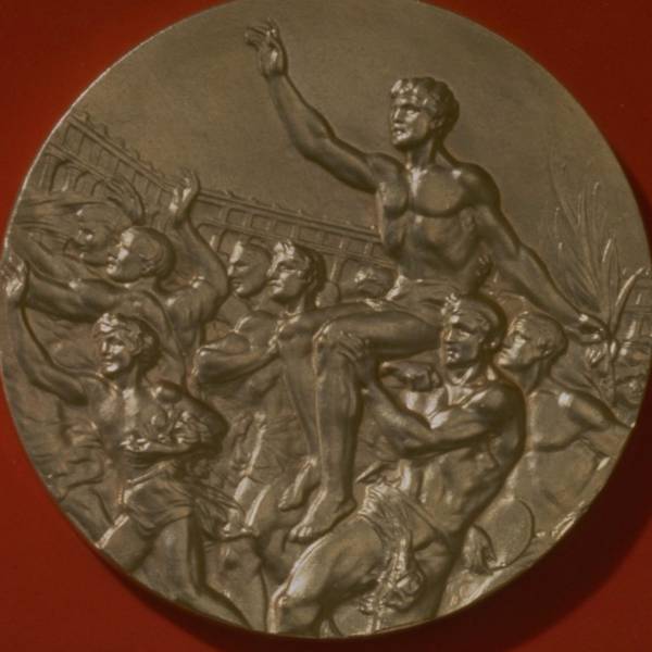
There's that victorious athlete and his fans again.
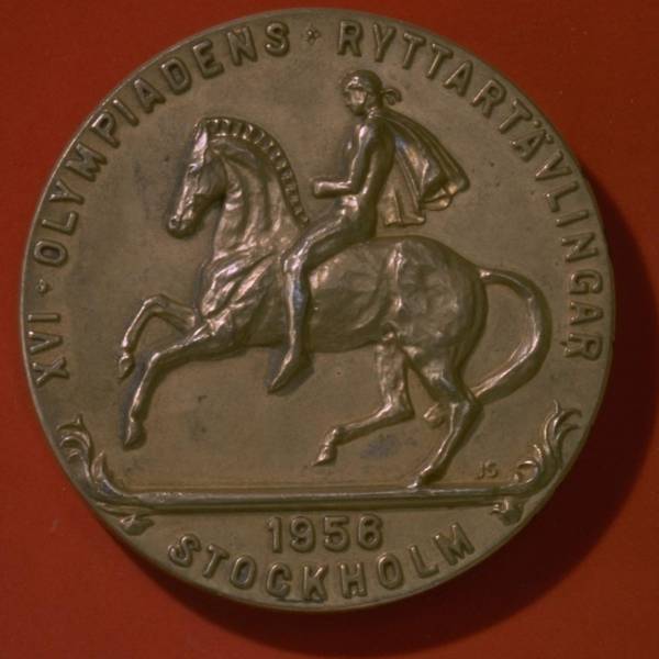
STOCKHOLM 1956: The 1956 Olympics were actually held in two places, as the equestrian events couldn't be held in Australia due to quarantine regulations. The equestrian athletes got a different medal, which had a horse on it.
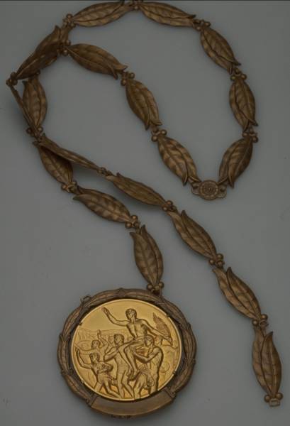
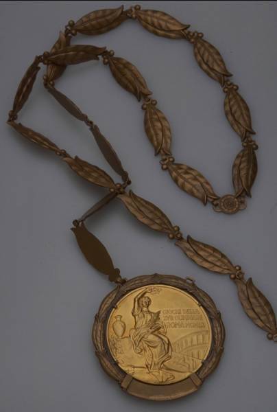
ROME 1960: The medals at the Rome Games used the same design as the past Olympics, except the obverse and reverse were switched, so the champion athlete was on the front of the medal. They also had a bronze laurel wreath surrounding the medal and a similar chain.
The goddess Nike was on the reverse of the 1960 medals, rather than the obverse.
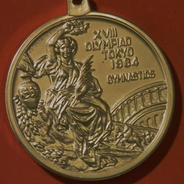
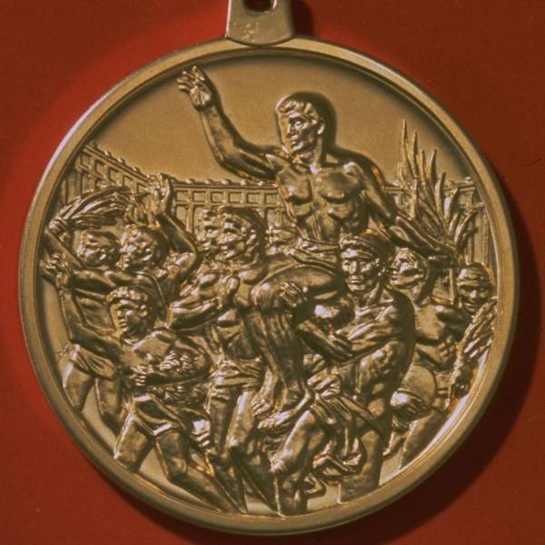
TOKYO 1964: Things went back to normal for the 1964 Olympics in Japan.
The triumphant athlete was back on the reverse of the medal again.
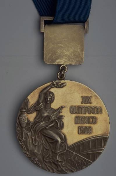
MEXICO CITY 1968: They start getting interesting again after this Olympics.
Here's the champion on the reverse one more time.
MUNICH 1972: The front of the medal at the Munich Olympics was the same as it had been for the last several decades.
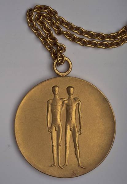
But the back was different. It depicted Zeus' twin sons, Castor and Pollux, the patrons of sports competitions and friendship.
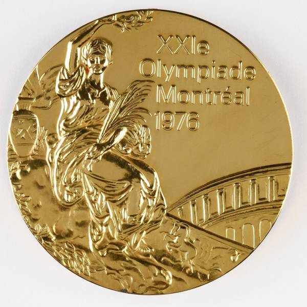
MONTREAL 1976: The obverse remains the same.
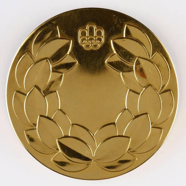
The reverse depicts a simple laurel crown as well as the emblem for the Olympics that year.
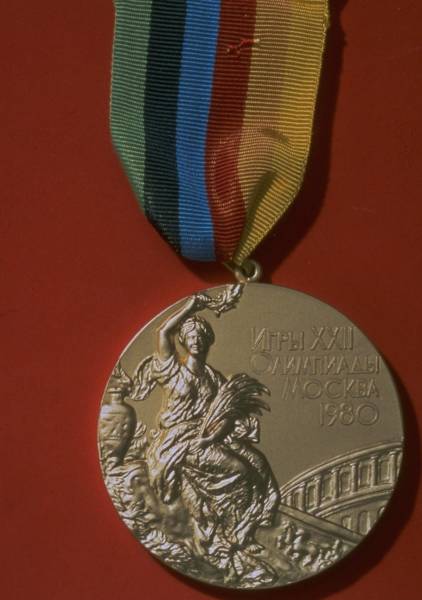
MOSCOW 1980: The classic design from 1928 makes another appearance.
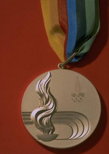
The back depicts a stylized Olympic bowl with a burning flame along with the host city's emblem.
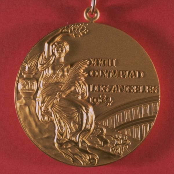
LOS ANGELES 1984: The '84 Games used the Cassioli design on the obverse once again.
They also went back to depicting a champion athlete on the reverse, though the design was updated slightly by American illustrator Dugald Stermer.
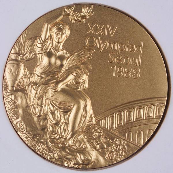
SEOUL 1988: Nike appears once again on the obverse.
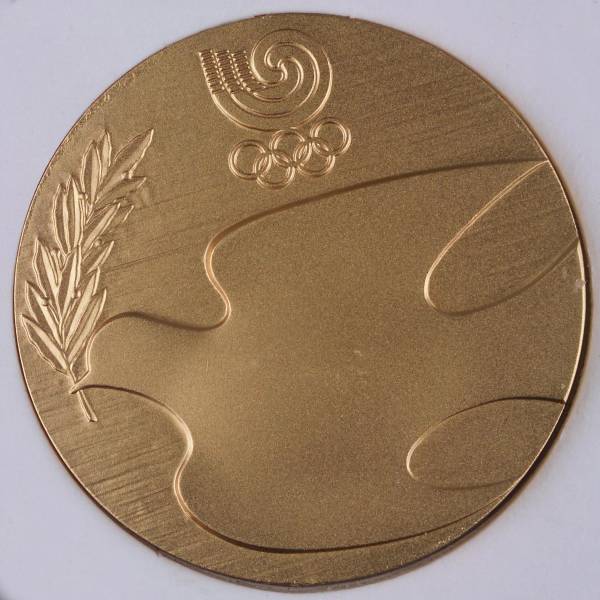
A dove, the international symbol of peace, graces the back of the medal.
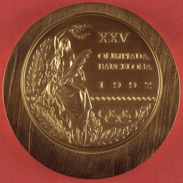
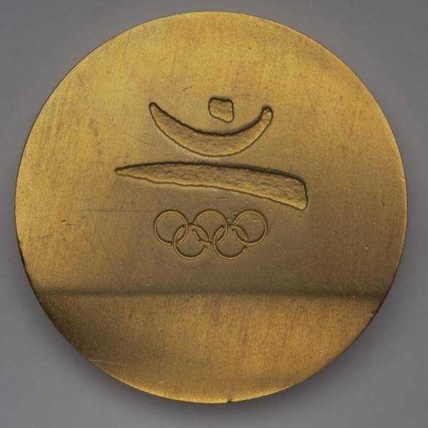
BARCELONA 1992: The front depicts Nike holding her traditional items, but the design is new.
The reverse shows the emblem of the '92 Games, a figure of victory drawn in a Modernist style.
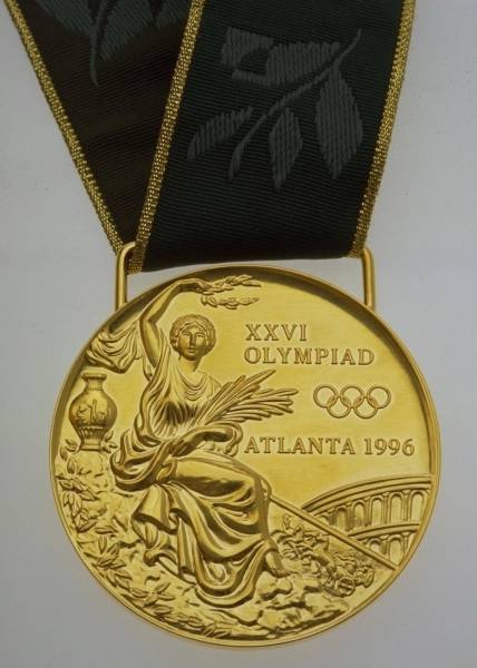
ATLANTA 1996: The Atlanta Games opted for a more traditional version of Nike.
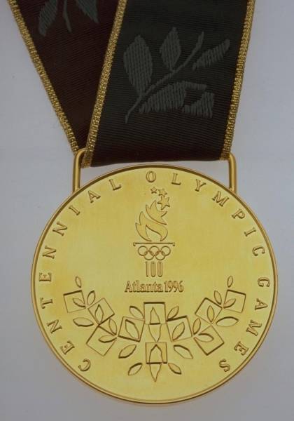
The reverse depicts the emblem of the game — the Olympic flame — and a "Quilt of Leaves" design. The medals given to athletes included the pictogram of their sport positioned in the middle of the quilt.
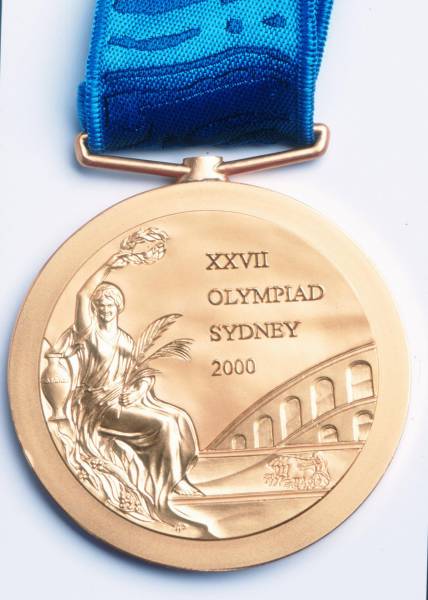
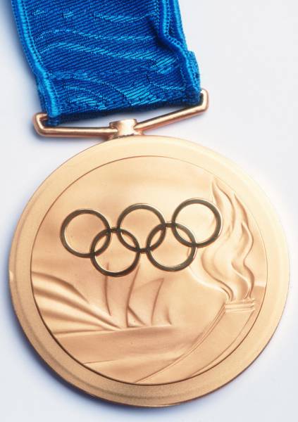
SYDNEY 2000: The first Olympics of the new millennium once again used a riff on the classic 1928 design, though there's an additional border around the image. There was a major controversy surrounding these medals, as Greeks were outraged that the stadium in the background was Roman, not Greek. Why it took until 2000 to notice this is a puzzler.
The reverse depicts the Olympic Rings, the torch, and the iconic Sydney Opera House.
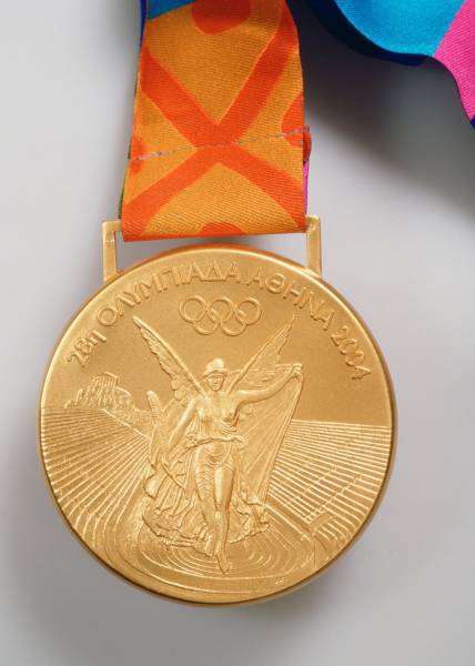
ATHENS 2004: The return of the Olympics to Greece saw a major design overhaul for the first time — especially in the wake of the previous Olympics' Roman stadium controversy. The new design depicts Nike flying into the Panathenaic stadium that was used for the 1896 Games.
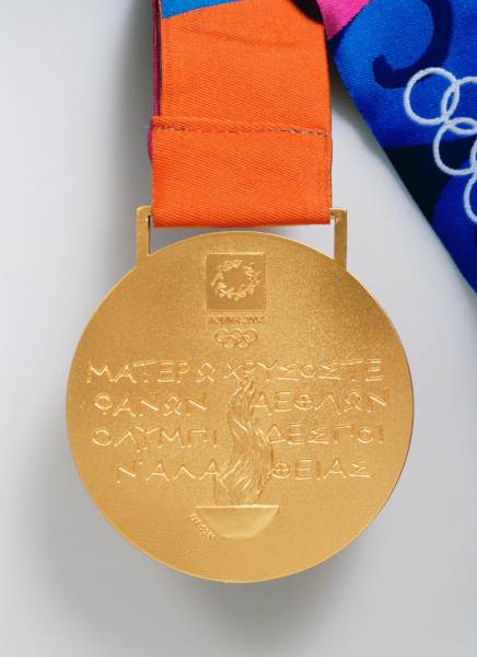
The back is inscribed with Pindar's Eighth Olympic Ode, originally composed in 460 B.C. to honor Alkimedon of Aegina wrestling victory.
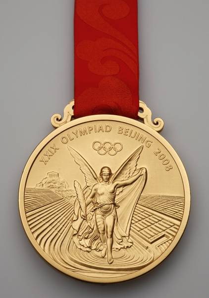
BEIJING 2008: The new Nike design once again appears on the obverse of the medal.
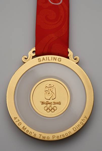
The backs, however, are inscribed with the games' emblem and a ring of jade, an important and common gem in Chinese culture.
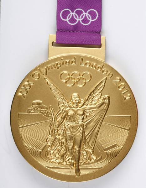
LONDON 2012: The new winged Nike graces the front again.
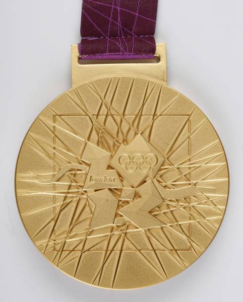
The reverse shows the emblem of the 2012 games and an abstract design meant to evoke a modern city. The curve behind the emblem represents the Thames River.
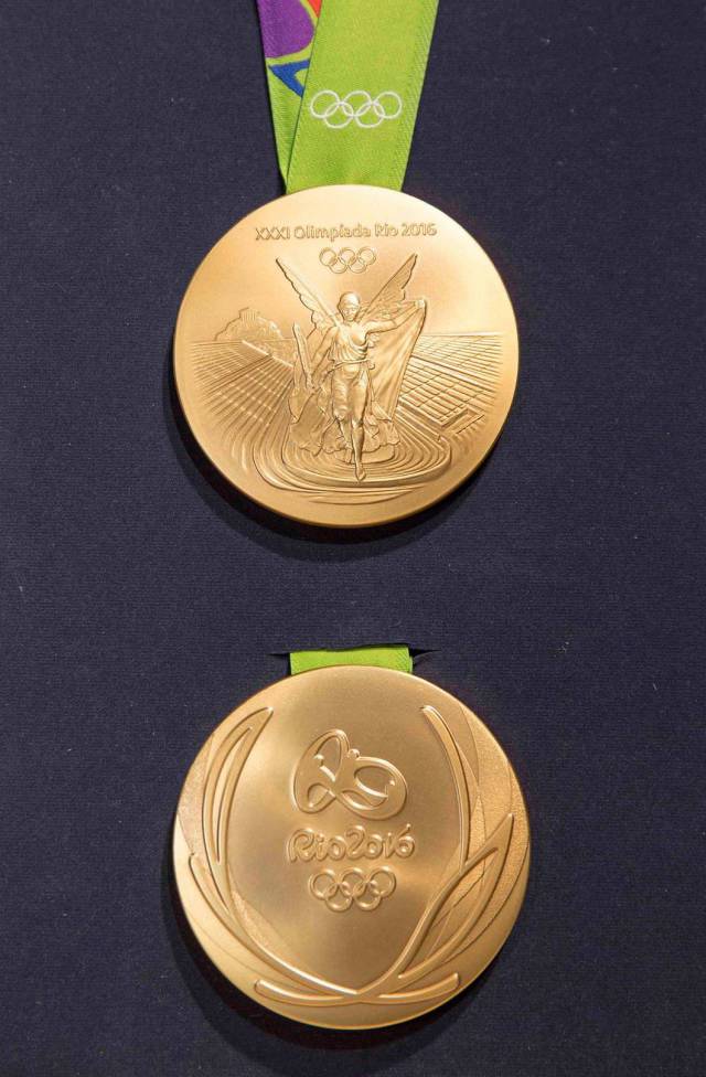
RIO 2016: The design for the current Summer Olympics once again features Nike on the obverse, and the reverse depicts the emblem of the games along with a subtle, stylized laurel wreathe.

