0

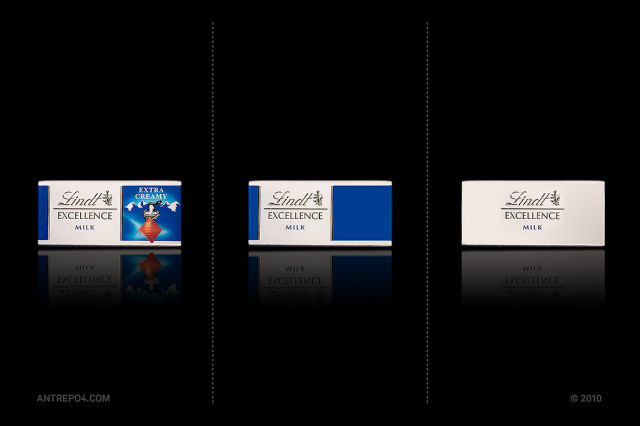
2.
janDZ 15 year s ago
9 & 8 look better in the right panel
0
5.
AnnaMolly 15 year s ago
This is bad for the people who don't know these brands. I didn't know what a Toffifee was and I wouldn't know how it looks like if the packaging wasn't like the first one.
0
7.
Jayzen Freeze 15 year s ago
most now look like crap 1 4 and 9 are nicer #1 looks tacky in the beginning
0
8.
rapulsel 15 year s ago
Well I'll be a rare but they are better all the right.
Pues seré un raro pero son mejor todas de la derecha.
0
9.
sn 15 year s ago
bad idea in #8, nutella without the picture of bread and nuts looks like a jar of sh*t
0
11.
Red Nail Polish Girl 15 year s ago
The ones in the middle are the best ones, in my opinion :)
Well I'll be a rare but they are better all the right.
Pues seré un raro pero son mejor todas de la derecha.