#1, 4, and 9 are good. #3 and #7 don't work because you know the background is so far in the distance, but here some of the bg is in focus so that ruins the effect.
The problem with "Tilt-Shift" is that 99% of the time, it's not even tilt-shift anymore. It's a bloody instagram filter or some other garbage. #3 is just depth of field.
The ONLY one I like, which is indeed tilt-shift, is #1.
agree with you guys. i love tilt-shift photos normally, but something's just not right about this batch. too much detail in certain places, like the foreground of #4, #7, #10, ruining the effect.
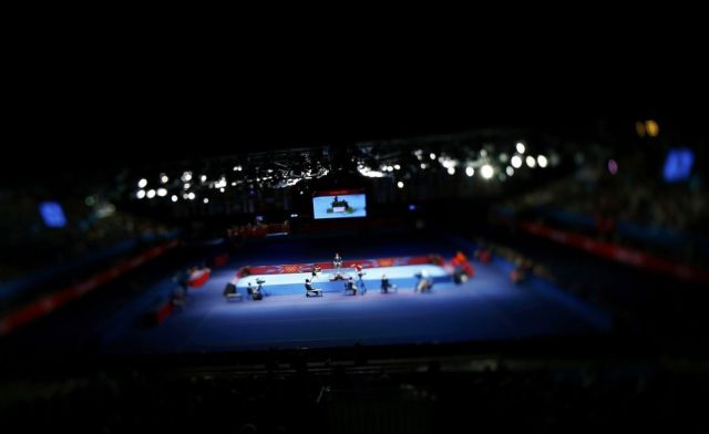
The ONLY one I like, which is indeed tilt-shift, is #1.