X


Comments to #1
All comments (4)
1


1.
AMemoriam 13 year s ago
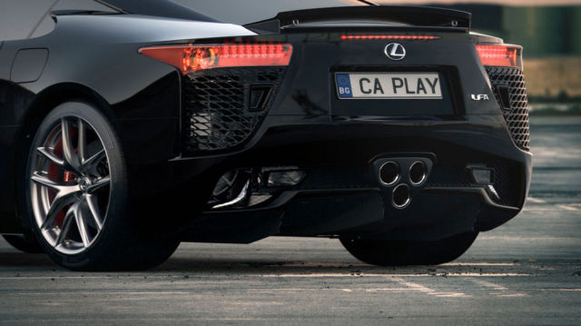
11 out of 12 Correct. Most of these are pretty bad. The lighting on the car #1 sucks. The nike logo #2 in the right corner is horrible, it's a total different black. The shades of the chair #6 doesn't make sense..
0


2.
gigantes 13 year s ago
wow... it was much harder for me.
0


3.
jan_kowalski 13 year s ago
#4 is also fake, I have this scene for 3dsmax right now
0


4.
java 13 year s ago
Can You share that one with us ?
Click on the image to see the right answer.

1.
AMemoriam 13 year s ago
11 out of 12 Correct. Most of these are pretty bad. The lighting on the car #1 sucks. The nike logo #2 in the right corner is horrible, it's a total different black. The shades of the chair #6 doesn't make sense..