X
Comments to #1
All comments (X)
McDonald’s
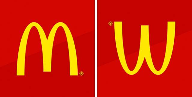
The designer of the first McDonald’s restaurants came up with the idea to equip the buildings with two large golden arches. These architectural features quickly became the symbol of fast food. Later, the company wanted to abandon the logo, but psychologist Louis Cheskin persuaded the management to keep it. He argued that this symbol looked similar to an upside-down image of the female breasts and therefore reminded people of their carefree childhood.