X
Comments to #3
All comments (X)

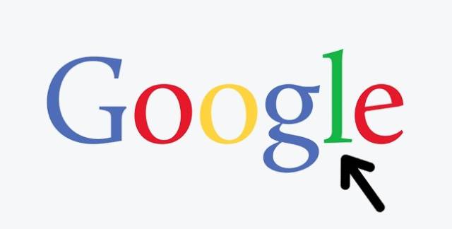
The Google logo’s creators used three main colors: red, yellow, and blue. You may notice that their arrangement within the logo is subject to a specific algorithm. But the green-colored letter breaks with the overall logic, and it is clearly meant to be the most important letter in the word. With this unexpected splash of green, the designers seem to imply that Google is about breaking stereotypes and not playing by the usual rules.