X


Comments to #9
All comments (5)
0

1.
Laveda 3 year s ago
I'm not sure if I love it and find it relaxing or if I'd freak out at all the brown eventually. Live there awhile and going out to the rest of the world would be like The Wizard of Oz going all colorized all of a sudden. Still one of the best special effects to this day.
4
2.
Lan 3 year s ago
I have been there, it is a beautiful city... Japan does not exactly look the way you might expect, but above all it is CLEAN and the people are very friendly!
0
3.
Elswood 3 year s ago
Lan, Crime rate so low, the Police don't know what to do with their time!
6
4.
Vickie 3 year s ago
The point to traffic cones being bright orange is that it alerts drivers. Having brown cones to fit the city’s color scheme isn’t very smart. It seems like something an oblivious heiress might do.
0
5.
Lonny 3 year s ago
So, basically, the city looks like a picture out of your great grandma's picture album from the 1920's!!!
Global as well as local brands have to adapt to the city’s brownish color scheme
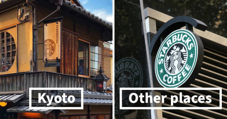
Starbucks—which is known for its white and green-colored logo—also altered its sign in Kyoto to blend in with traditional Kyoto-style houses. Same goes for 7-Eleven, a chain of convenience stores with 20,000 branches in Japan and 60,000 worldwide. All around the world, it has a bright logo with orange, red, and green stripes. In Kyoto, the logo features a calm combination of brown and white. Tsunagu Japan writes that while some branches have maintained the original colorful logo, they made the white stripes transparent to make them blend in more with the surroundings.
0
1.
Laveda 3 year s ago
I'm not sure if I love it and find it relaxing or if I'd freak out at all the brown eventually. Live there awhile and going out to the rest of the world would be like The Wizard of Oz going all colorized all of a sudden. Still one of the best special effects to this day.
4
2.
Lan 3 year s ago
I have been there, it is a beautiful city... Japan does not exactly look the way you might expect, but above all it is CLEAN and the people are very friendly!
0
3.
Elswood 3 year s ago
Lan, Crime rate so low, the Police don't know what to do with their time!
6
4.
Vickie 3 year s ago
The point to traffic cones being bright orange is that it alerts drivers. Having brown cones to fit the city’s color scheme isn’t very smart. It seems like something an oblivious heiress might do.
0
5.
Lonny 3 year s ago
So, basically, the city looks like a picture out of your great grandma's picture album from the 1920's!!!