X
1
1.
Orlando 3 year s ago
Then there's Coca-Cola...
       
1
2.
Hugh 3 year s ago
Which redesigns weren’t as successful as expected, all 42?
       
0
3.
Biddy 3 year s ago
Hugh, 39 of them
       
-13
4.
Martin 3 year s ago
The new versions are way better than the old. People just don’t like change.
       
2
5.
Nik 3 year s ago
#39 Your number one domestic carrier to get you Straight Outta Compton!
       
5
6.
Biddy 3 year s ago
AKA, executives who have nothing better to do
       
3
7.
Clum 3 year s ago
The Rams one is really bad.
       
1
8.
Eva 3 year s ago
#39: Nuns With Attitude
       
-1
9.
Lorrie 3 year s ago
Now Burger King is the same as it was in the 80's they just lost the "home of the whopper" sign underneath.
       
2
10.
Eric 3 year s ago
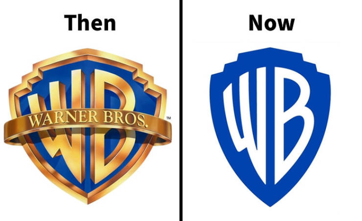
All about simplifying, making things more clean and straight to match current trends. When digital graphics were developed, everything was about adding depth and creating realistic lighting and shadows to attract people.
That's just development. Who knows how it will change in the next 20 years.
       
2
11.
Jackie 3 year s ago
I hate #2.

#17 seems to get worse year-by-year, too. Still better than the alternative, though.
       
4
12.
Obie 3 year s ago
I think I see a pattern here; all the NOW ones are boring.
       
2
13.
Elbert 3 year s ago
Obie,

its called simplistic minimal material design or some similar boring bullsh#t.
       
27353641acute
belayclappingdance3dashdirol
drinksfoolgirl_craygirl_devilgirl_witch
goodgreenheartJC-LOLJC_doubledown
JC_OMG_signkisslaughingman_in_lmocking
mr47_04musicokroflsarcastic
sm_80tonguevishenka_33vomitwassat
yahooshoot
X
Company Logo Redesigns That Weren’t As Successful As Expected…
>
1/42
<