Nintendo
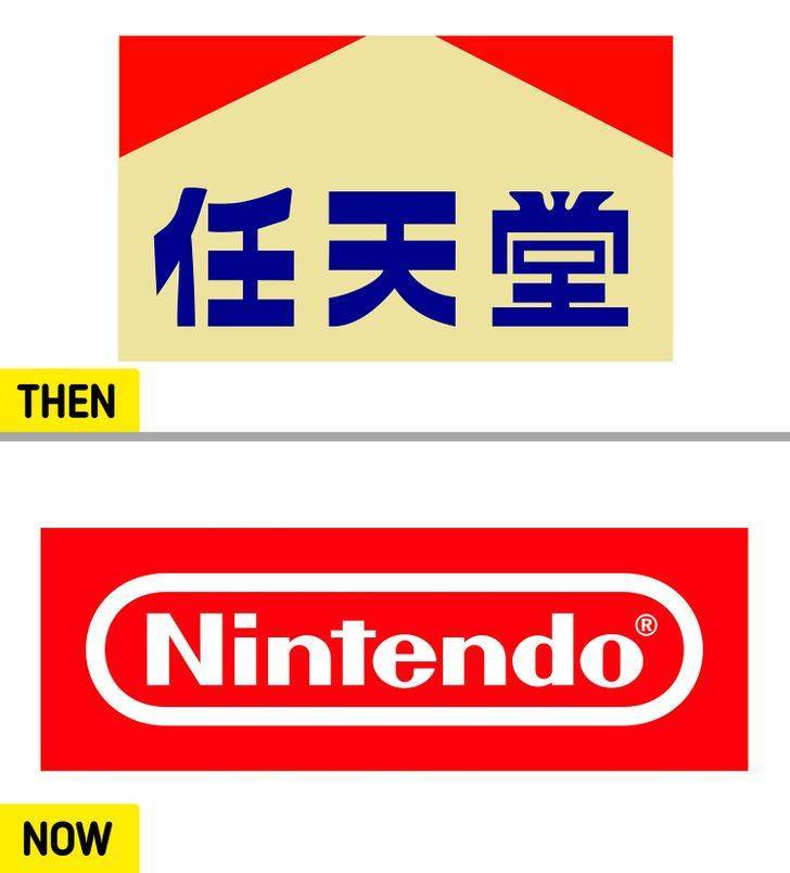
From 1889 to 1950, Nintendo’s logo was written in the language of the company’s place of birth, Japan. The following logos adopted a western spelling of the company’s name until 2016 when the public was introduced to its current version.
5

1.

Pinckney 2 year s ago
Pepsi and Canon used to look like the logo of a death metal band :D
2
2.

Jed 2 year s ago
Pinckney,
everything was better, then.
everything was better, then.
2
3.

Jos 2 year s ago
#3 50 years ago, Canon had their current logo.
1
4.

Marge 2 year s ago
#16 The BB€ wasting British people's licence fees for decades ..... no longer mine though 
-2
5.

Roseanne 2 year s ago
fuck them all they are all bad for the enviroment and for society
everything was better, then.