3.

Karon 3 year s ago
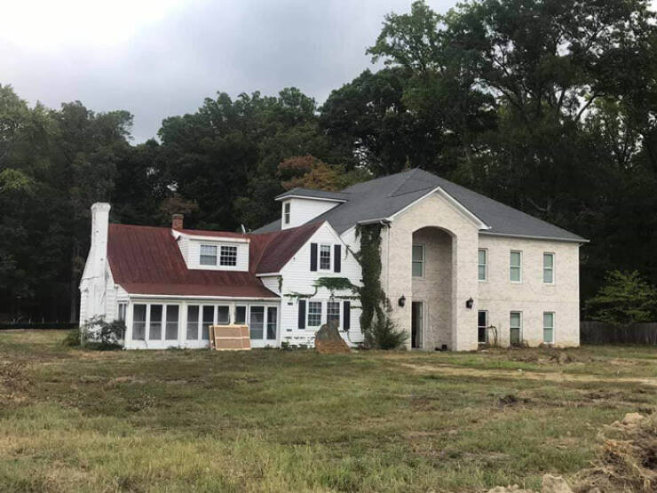
#1 It's not architecture, it's a paint job.
#4 Looks like the new part is sinking into the swamp
#5 f*in Elitist Right Footers, discriminating against us Left Footers
#24 Well look at that, they didn't mount the double wide trailer on the foundation right.
#26 We used to think school was prison, I can't imagine having home be a prison too.
#4 Looks like the new part is sinking into the swamp
#5 f*in Elitist Right Footers, discriminating against us Left Footers
#24 Well look at that, they didn't mount the double wide trailer on the foundation right.
#26 We used to think school was prison, I can't imagine having home be a prison too.


#4 Looks like the new part is sinking into the swamp
#5 f*in Elitist Right Footers, discriminating against us Left Footers
#24 Well look at that, they didn't mount the double wide trailer on the foundation right.
#26 We used to think school was prison, I can't imagine having home be a prison too.