–
These maps are an interesting project that was developed by Eric Fischer. The maps show the population of various American cities by race and ethnicity, which are color-coded. Here’s what the colors stand for: Orange represent Hispanic population, Red is White, Blue is Black, green – Asian, Grey is other and each dot represents 25 people.. Really interesting and informative.
Los Angeles
–
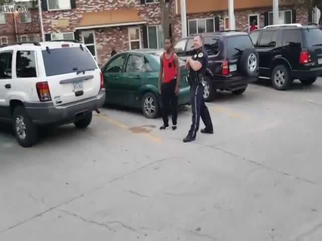
What would you do if you were him?
–
Posted in
VIDEO 22 Jul 2019
3322
–
Posted in
VIDEO 8 Jul 2019
3004
–
Posted in
8 May 2017
5019
–
Posted in
VIDEO 13 Apr 2017
2993
–
Posted in
VIDEO 22 Mar 2017
4239
–
Posted in
22 Sep 2016
3320
–
Posted in
VIDEO 3 Aug 2016
4456
–
Posted in
VIDEO 6 May 2016
4277
–
Posted in
VIDEO 25 Apr 2016
4801
–
Posted in
VIDEO 8 Apr 2016
4467
–
Posted in
VIDEO 7 Mar 2016
3020
–
Posted in
VIDEO 21 Nov 2015
2791
–
Posted in
VIDEO 7 Oct 2015
5154
–
Posted in
VIDEO 13 Jul 2015
4587
Fernando Alonso visited the Daytona Sandown Park to take their Dmax Karts for a test drive.
02:52
–
Posted in
VIDEO 29 May 2015
8150
An unexpected guest joins a race between a Nissan 350Z procharger and a Porsche 991 GT3.
00:37
–
Posted in
VIDEO 12 May 2015
5824
–
Posted in
VIDEO 17 Apr 2015
6907
–
Posted in
VIDEO 16 Apr 2015
4949
Dude got away with only 6 stitches!
00:42
–
Posted in
VIDEO 13 Apr 2015
4728
–
Posted in
VIDEO 19 Mar 2015
9324
–
Posted in
VIDEO 13 Mar 2015
4567
")