Racially Divided Map of America (66 pics)

Posted in PICTURES       27 Sep 2010       16039

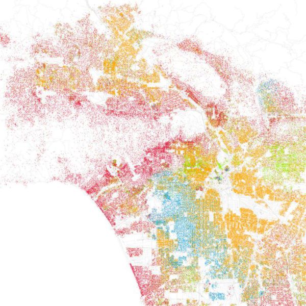
These maps are an interesting project that was developed by Eric Fischer. The maps show the population of various American cities by race and ethnicity, which are color-coded. Here’s what the colors stand for: Orange represent Hispanic population, Red is White, Blue is Black, green – Asian, Grey is other and each dot represents 25 people.. Really interesting and informative.


Los Angeles

Racially Divided Map of America (66 pics)
GALLERY VIEW COMMENTS (23)

How to comment

•    Don't insult other visitors. Offensive comments will be deleted without warning.

•    Comments are accepted in English only.

•    No swearing words in comments, otherwise such comments will be censored.

•    Your nickname and avatar are randomly selected. If you don't post comments for 7 days, they both are reset.

•    To choose another avatar, click the ‘Random avatar’ link.

random_banner_1