X
Comments to #2
All comments (X)
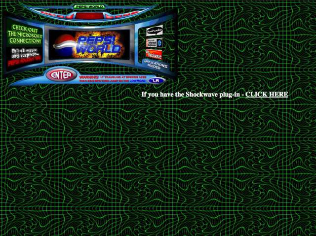
Pepsi's 1996 web page was a Gen-X disaster.
Pepsi might've beaten Coca-Cola in blind taste tests, but their choice in web design was atrocious. The background pattern looks like a trapper keeper design, and the choice to toss in the "Pepsi World" hub, or whatever monstrosity that thing is in the top corner, was a baffling choice to say the least.