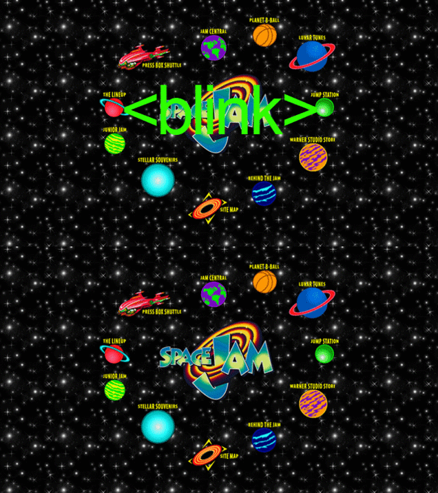
Motherflippin' Space Jam.
Spoiler alert: if you haven't seen or heard of Space Jam you are simultaneously missing out on the greatest cinematic experience/glorified commercial of all time and had a terrible childhood. When the movie was released they used this amazing website to help promo it. The 30 people who had internet access really appreciated the effort. Oh yeah, and did we mention it's still active? You're welcome.
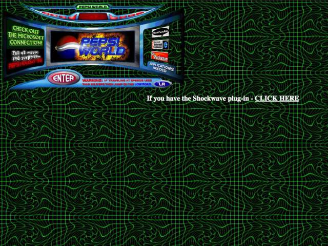
Pepsi's 1996 web page was a Gen-X disaster.
Pepsi might've beaten Coca-Cola in blind taste tests, but their choice in web design was atrocious. The background pattern looks like a trapper keeper design, and the choice to toss in the "Pepsi World" hub, or whatever monstrosity that thing is in the top corner, was a baffling choice to say the least.
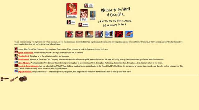
Coke's wasn't much better, either.
It looks like they had a "make your own website day" in a nursing home back in '96, and picked Betty's winning design.
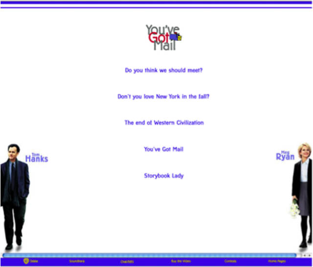
You've Got Mail: Crappy movie, worse website.
For some reason the website for this internet-themed romantic comedy (hey back in 1998, it was progressive!) is still up on the web. Each one of those telling lines above is a link. Who/what is "Storybook Lady," we're so intrigued!
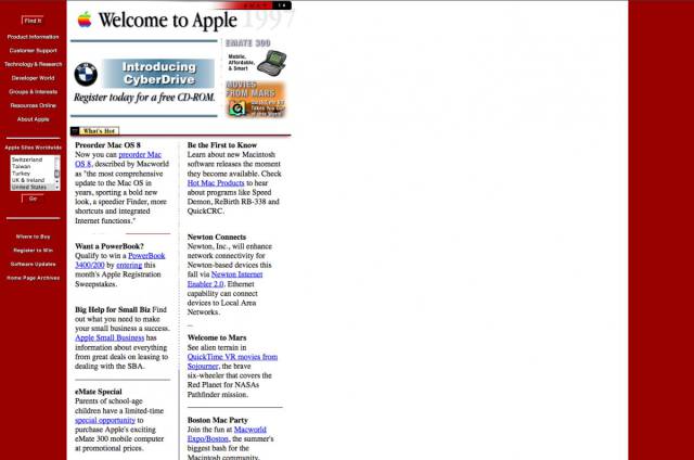
Apple's website is the ugly duckling of the tech world.
The Cupertino based tech giant is known for being pretty much the sexiest brand on the planet, but back in '97, its website had zero game. Like, zero.
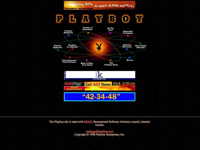
Playboy's '96 website was about as sexy as the yellow pages.
It kinda looks like the Space Jam site, which is a bit startling.
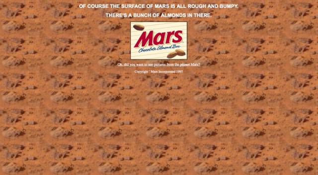
Mars' candy website was just a setup for a crappy joke.
It's bad enough that Mars bars are only sold at middle-of-nowhere truck stops, but their website was just pathetic.
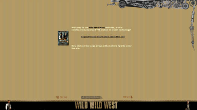
The Wild Wild West site that is whicky whicky whack.
Yes, we say is, because it's still online. Some things never die, like the idea to put a giant spider into a movie, which Kevin Smith has a hilarious story about...
The Dole/Kemp campaign website.
Hey, remember when people honestly thought that Bob Dole had a shot at becoming the President of the United States of America? Yeah, neither do we. By '96 standards the website wasn't terrible, and if you want to relive the glory, just click right here because no one took this bad boy down yet.
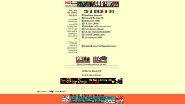
CNN's 1996 Year in Review.
If you really want to get a feel for what 1996 was like, just click on this fugly as hell web page. It's like walking into a hideous time warp.
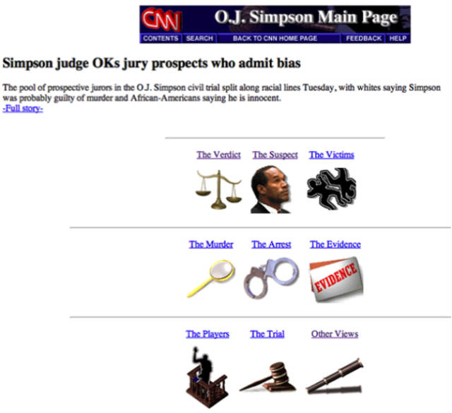
The O.J. Simpson trial page.
Awe snap it doesn't get much more '90s than this motherf*cker. The OJ Simpson case was an absolute cultural phenomenon, so of course someone would dedicate a website to it back in '96. If you want to catch up on this epic trial and all its particulars, there are probably way better resources out there, but none as retro fabulous as this one.
The Robert DeNiro Page
Fan of DeNiro's acting? Well now everything there is to know about Bobby D. — in 1999 — is on this website. It even has a java chat option! Neat-o!
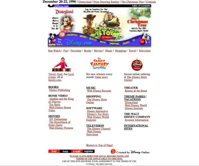
Disney's 1996 website was boring as hell.
Seriously, this thing is about as magical as an Office '98 word document. Wait, oh my God, is that comic sans in the banner image?!
McDonald's site in 1996 was...uninspiring to say the least.
What a turd casserole of a page.
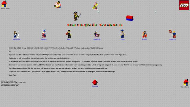
Lego's '96 web page will make you ask one question...
Why the hell is there so much empty space on the page? Did people have better vision back in the '90s, or something? Also, they committed the sin of using Comic Sans...with rainbow letters. We've all done it, but come on, this is the image you're projecting to the world for one of the most beloved toy brands. Don't screw it up. At least they have a lego style background, so A for effort, '96 Lego web developer.
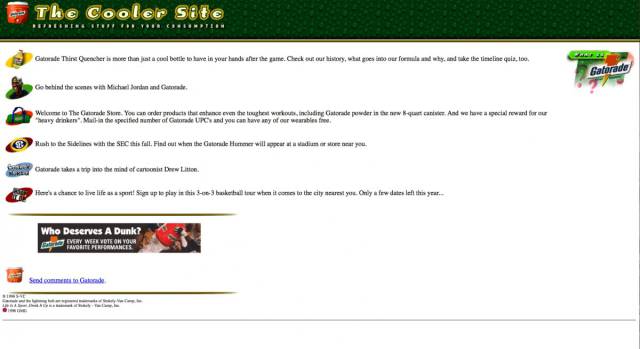
Gatorade in '96; not so bad.
Pretty good, considering that they sell salted, artificially colored/flavored sugar water. Way better than McDonald's site, at least we can go behind the scenes with Michael Jordan and Gatorade, and sign up to play in a 3-on-3 basketball tour.
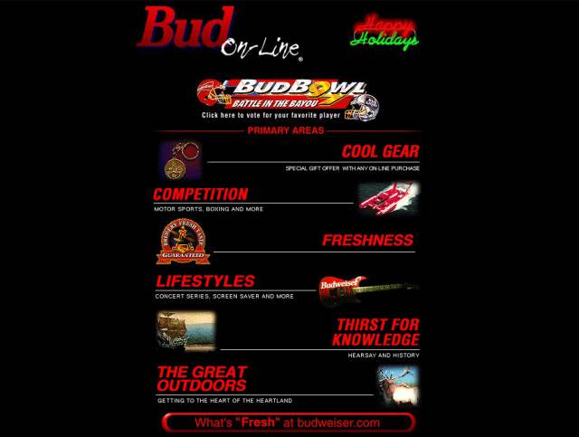
Budweiser's old site looked like a Nintendo video game box cover.
And we can't really blame them for modeling their site after it either, NES games kicked ass.
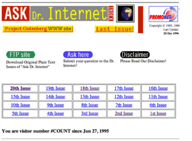
Ask Dr. Internet, and yes, it still works.
The doctor is in...TERNET! (hyuk hyuk). In all seriousness, forget Google even exists because everything you will ever need to know about the web is on this website right here.
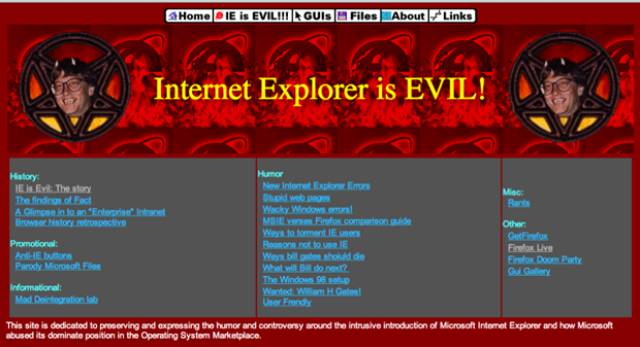
Internet Explorer is Evil!
Back when Microsoft revolutionized home computing and the web was still just being adopted for widespread consumer use, the tech giant decided to pre-install Explorer as the default browser for the Windows Operating System. Competing browsers, like Netscape, worried about this. And apparently this one guy who thought that Bill Gates was the devil.

