X
Comments to #15
All comments (X)
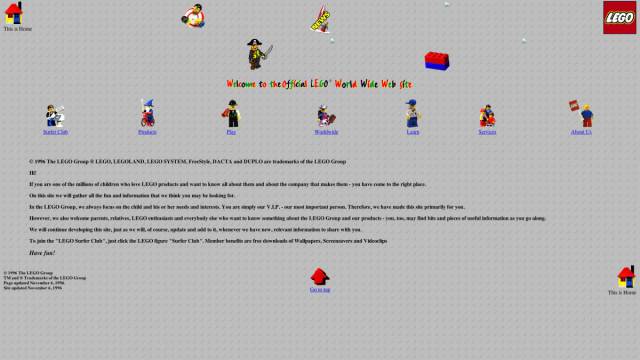
Lego's '96 web page will make you ask one question...
Why the hell is there so much empty space on the page? Did people have better vision back in the '90s, or something? Also, they committed the sin of using Comic Sans...with rainbow letters. We've all done it, but come on, this is the image you're projecting to the world for one of the most beloved toy brands. Don't screw it up. At least they have a lego style background, so A for effort, '96 Lego web developer.
