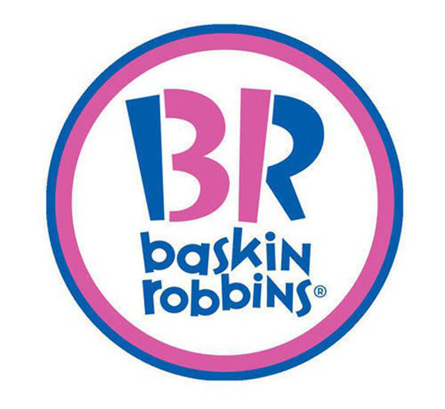
Baskin Robbins
There’s a 31 in the middle of its logo to represent the 31 flavors of ice cream it sells.
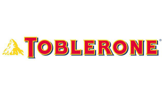
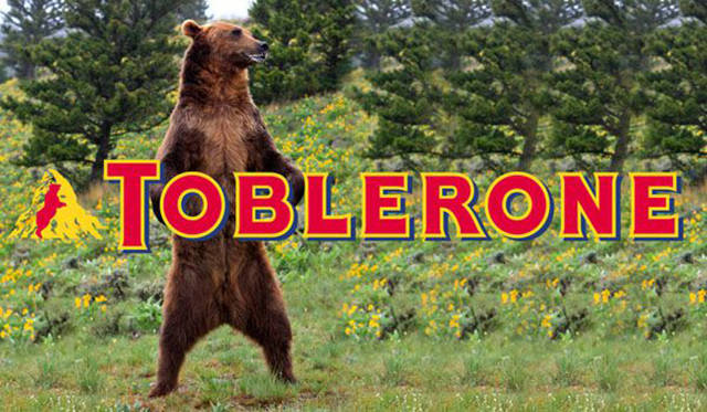
Toblerone
Hidden in the Matterhorn is an animal. If you stare at it for long enough, you might see what it is.
Museum of London
The overlapping colours in this logo actually represent the changing shape of London over the years.
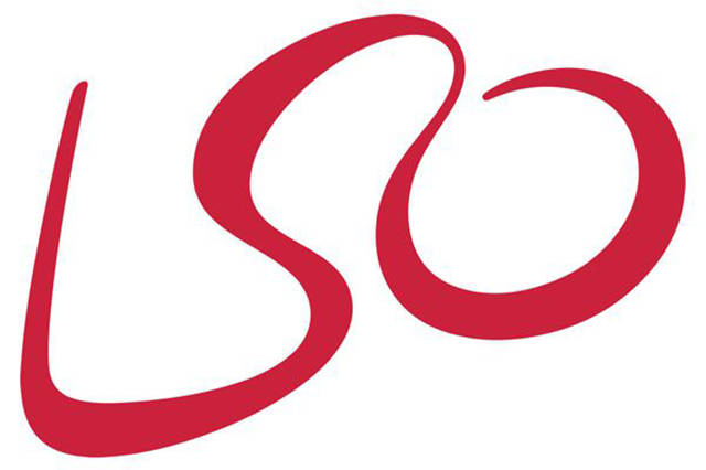
London Symphony
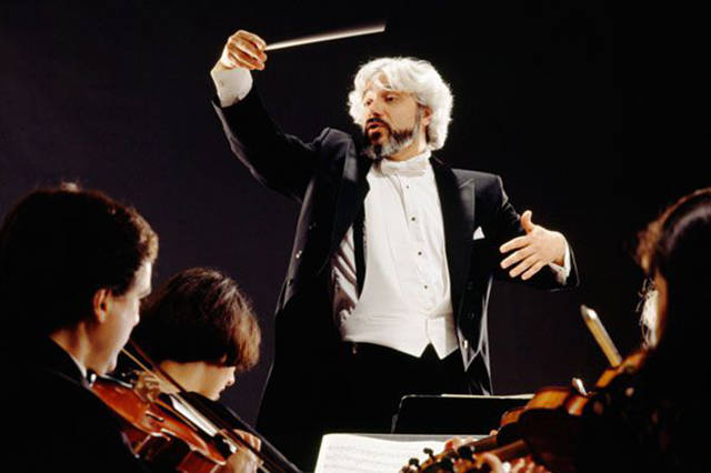
Orchestra This squiggle may look like it says LSO, but it is actually the shape of a conductor conducting his orchestra.
Amazon
This is a play on words as well as a hidden image. There’s a smiley face for a happy service and the arrow from A to Z representing the speed and simplicity of their deliveries.
Sony Vaio
The V and the A actually show an analogue signal while the I and 0 are yet another binary reference indicating digital. It shows the shift from analogue to digital.
Picasa
The logo not only shows a camera shutter, but also makes a point about the branding. How good is your Spanish?
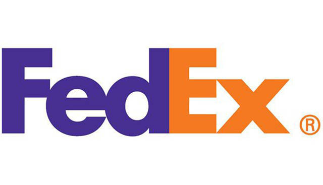
FedEx
A good optical illusion, and it has won the company a bunch of design trophies over the years. Look between the E and the X.
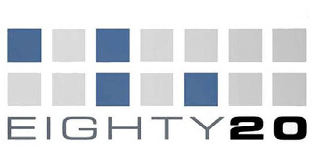
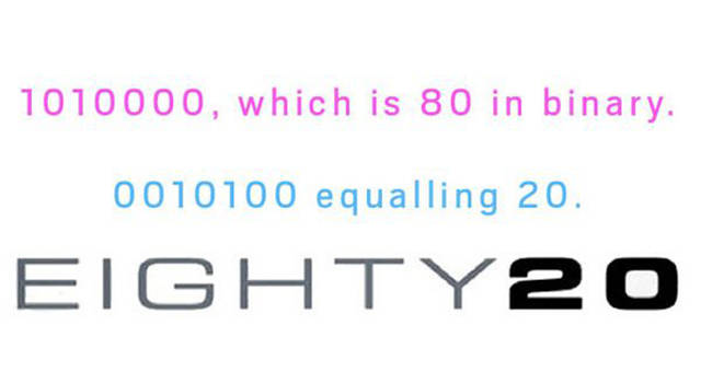
Eighty 20
This logo is binary: the dark squares are 1s in binary and the blank ones are 0s.
Continental
There’s a car tire in the big C of this brand name.
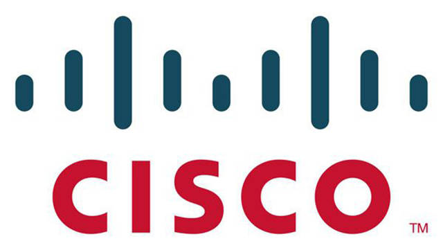
Cisco
Cisco was named after the city in California where it started out and logo is actually the famous bridge in the city.
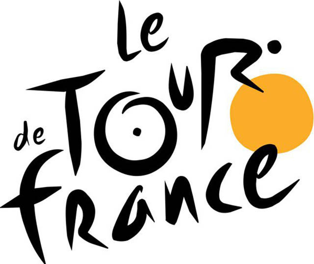
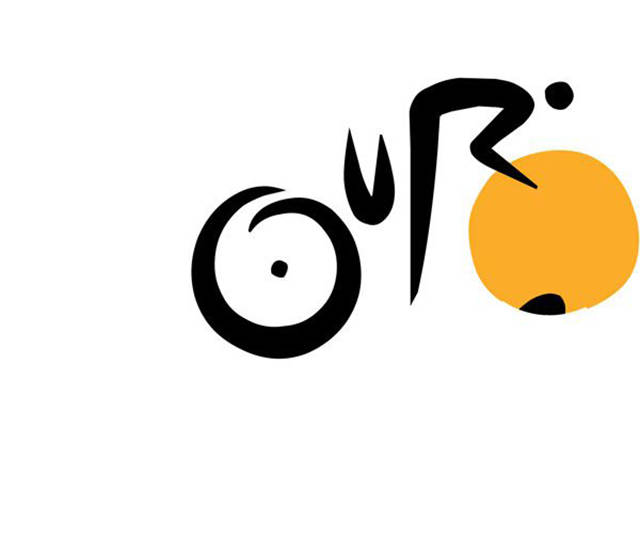
Tour de France
There’s a sneaky hidden man riding a bike. It’s a bike race after all.
Wikipedia
Wikipedia says each part of the puzzle bares a glyph symbolising the multilingualism of the organisation. The puzzle is also not complete symbolising the endlessly incomplete nature of the articles inside.

