X
Comments to #5
All comments (X)
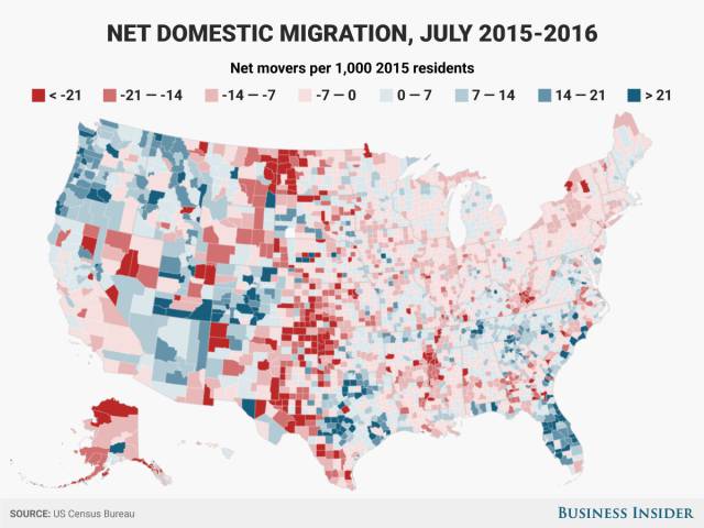
Americans move around a lot. This map shows what counties Americans moved to and from between 2015 and 2016. Red counties had more people moving out than in, and blue counties saw more people moving in than out.
