Caps and bottle on the Christmas Coca-Cola’s white bear
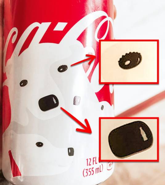
Every Christmas and New Year, Coca-Cola releases its drink in themed bottles. Part of one of the designs is a polar bear. Reddit user sunkist268 saw that, in fact, the eyes of the polar bear are bottle caps, and the reflection on the nose resembles the shape of a glass bottle from this company.
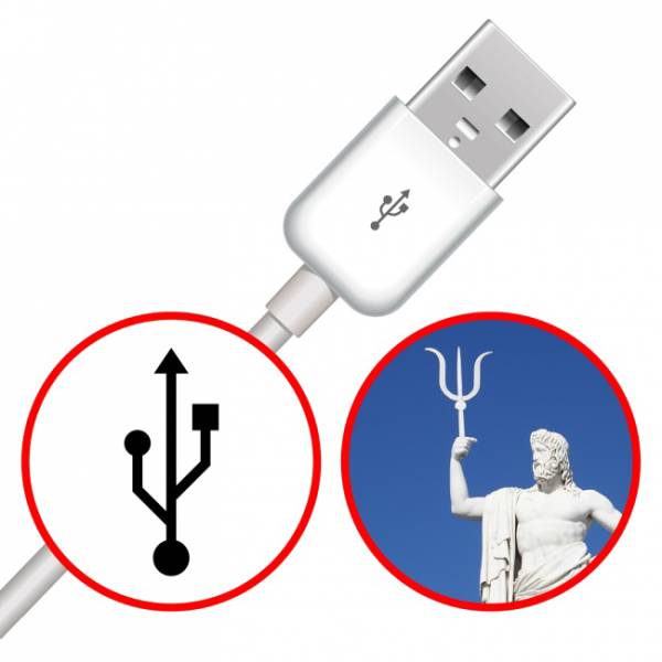
Neptune was the inspiration for the USB symbol.
The USB symbol was inspired by Neptune’s trident, which symbolizes strength. So it denotes the “strength” of one cable that works with different devices. And the different icons on the ends of the trident indicate its universality.
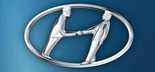
Handshake on a Hyundai
Most people think that the logo of this auto company stands for the first letter of its name. However, this isn’t true. In fact, in the form of an improvised letter “H,” a client and seller are depicted shaking hands.
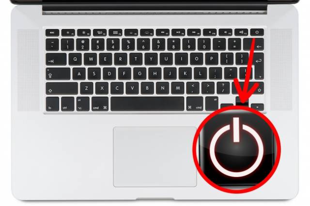
Binary numbers on the on/off button
The on/off button on your computer has a whole story behind it. According to an article on Gismodo, the circle and the stick on the button are “zero” and “one” — just like in the binary system. “Zero” means off, and “one” is on. The combination of these symbols is nothing more than a standby mode.
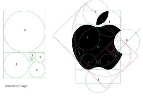
The golden ratio and the Apple logo
The secret of the famous bitten apple is its shape, which was built on the principle of the golden ratio. The form of the logo hasn’t changed since 1976 — even when it was decided to make the apple one color in 1998 and to give it volume in 2000.
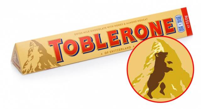
The bear on the Toblerone
The head office of the famous chocolate company is located in Bern, Switzerland, which is the city of bears (in German, “bear” is “Bär”). You might not have noticed, but you can see the bear on the logo, depicted against the background of the mountain.
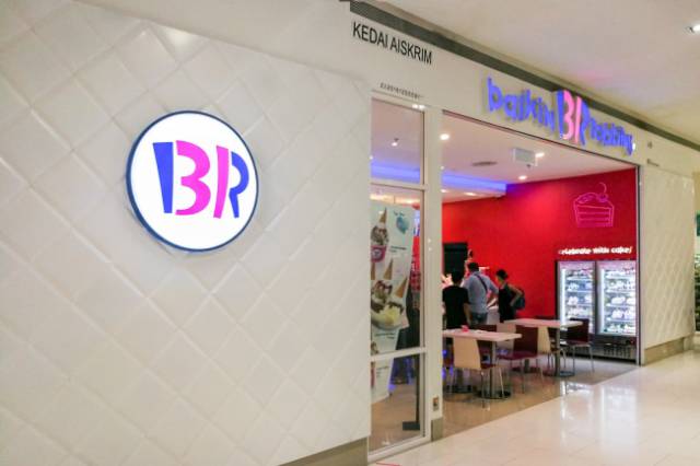
BR stands for 31.
This popular brand is known for its slogan “31,” meaning that the buyer can enjoy a new taste on any day of any month. The designers incorporated this number into the letters “B” and “R” in the company’s logo.
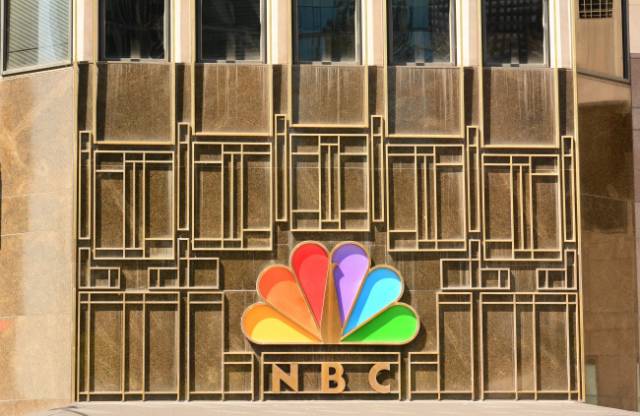
The peacock on the NBC logo
One of the most famous logos of all time is a peacock with 6 colored feathers. Each feather symbolizes one of the 6 divisions of the company (at the time when the logo was created). In the negative, you can see the head of the peacock looking to the right, and this indicates that the company is looking ahead to the future.
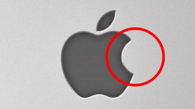
Apple’s “bite”
© apple.com
To develop a new logo, Steve Jobs turned to graphic designer Rob Janoff for help. They needed to create a simple, modern, and recognizable logo. Rob dealt with this task within a week. In an interview, Janoff talked about how the logo was created. Rob bought apples, put them in a bowl, and began to draw, consistently removing unnecessary details. The famous “bite” was made on purpose: it was necessary to draw a logo that was firmly associated with apples, not with other fruits, vegetables, or berries.
It seems that Rob coped with the task superbly. Not only is the logo insanely laconic, it also fits the golden ratio (as previously mentioned).
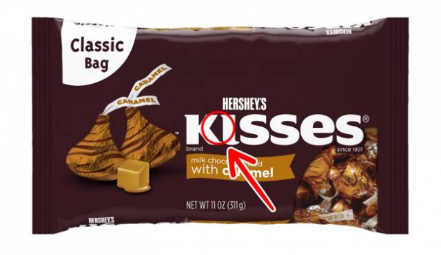
A kiss inside Hershey’s Kisses
Chocolate Hershey’s Kisses are one of the most popular in the US, and their unique shape was incorporated into the product logo. Look closely between the letters “K” and “I,” and you can see the most famous “kiss.”
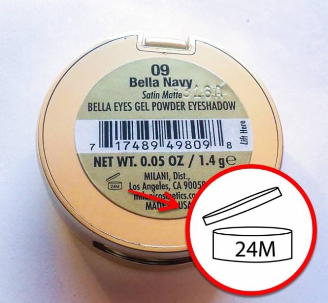
A cosmetic product’s lifetime
There is usually a tiny symbol on the packaging of cosmetic products. It shows us a period of months. For example, 24M means that, after opening the package, the product can be stored for 2 years. It is called the “Period-after-opening” or “PAO” symbol.
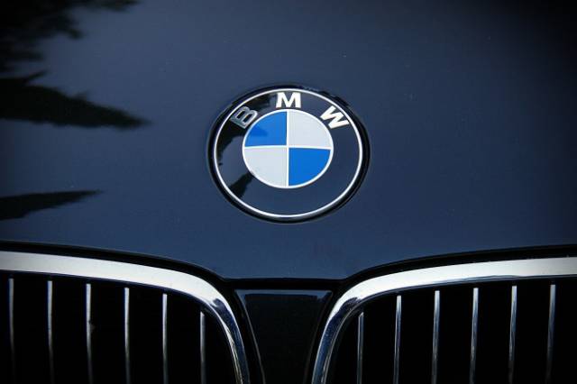
Sky and propeller on the BMW logo
Initially, the German company BMW produced aircraft engines, so the logo remains true to its history. The white sections represent a moving propeller, and the blue is the sky.
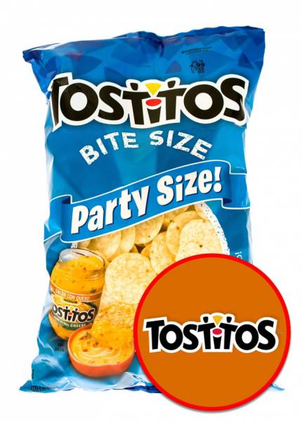
2 people with a bowl of dip on the Tostitos logo
2 of the letter “T’s” on the cheerful Tostitos logo resemble 2 people, and a bowl of salsa replaces the dot above the letter “i.” The design promotes the idea of getting together to share chips.
Pin it!
A key feature of this popular internet service is to collect and “pin” images you like. Therefore, the letter “P” is stylized to resemble a pin.
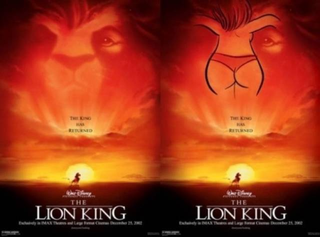
Unexpected moments in The Lion King
Hmmm... Erotica in a kids’ cartoon about animals? Don’t underestimate designers! The poster for The Lion King hides in a most prominent place...a woman’s behind in tight underpants. And as you can see, she is not wearing a bra either. Wishful thinking or reality? We guess we’ll never know.
