X
5
1.
Pinckney 2 year s ago
Pepsi and Canon used to look like the logo of a death metal band :D
       
2
2.
Jed 2 year s ago
Pinckney,

everything was better, then.
       
2
3.
Jos 2 year s ago
#3 50 years ago, Canon had their current logo.
       
1
4.
Marge 2 year s ago
#16 The BB€ wasting British people's licence fees for decades ..... no longer mine though dirol
       
-2
5.
Roseanne 2 year s ago
fuck them all they are all bad for the enviroment and for society
       
27353641acute
belayclappingdance3dashdirol
drinksfoolgirl_craygirl_devilgirl_witch
goodgreenheartJC-LOLJC_doubledown
JC_OMG_signkisslaughingman_in_lmocking
mr47_04musicokroflsarcastic
sm_80tonguevishenka_33vomitwassat
yahooshoot

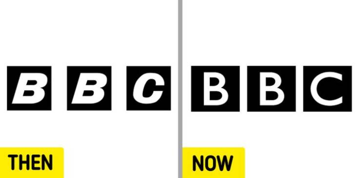
Bonus: BBC

BBC’s present logo is the fifth version of the 3-box design. The first was used from 1958 until 1963. As previously mentioned, BBC’s logo redesign was a pricey one. But without changing what the public recognizes the most about it, the UK national broadcaster was still able to modernize its image.


X
Famous Brand Logos: 50 Years Ago Vs Now
>
16/16
<