These maps will give you a better understanding of the United States in relation to the rest of the world.
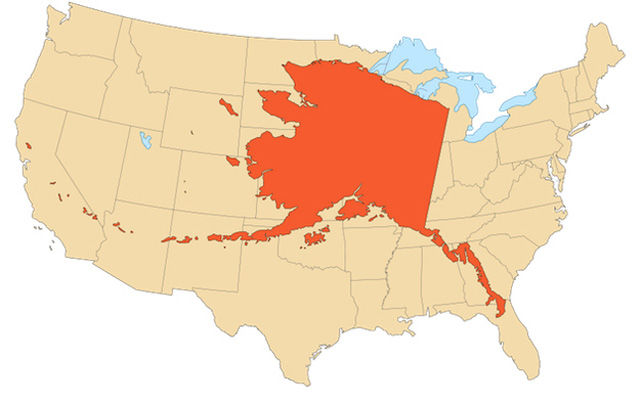
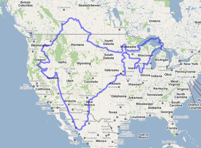
Alaska x The Contiguous United States
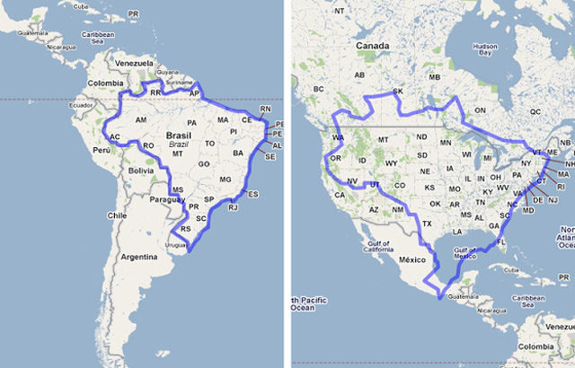
Brazil x The United States
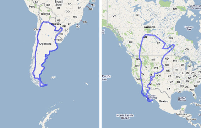
Argentina X The United States
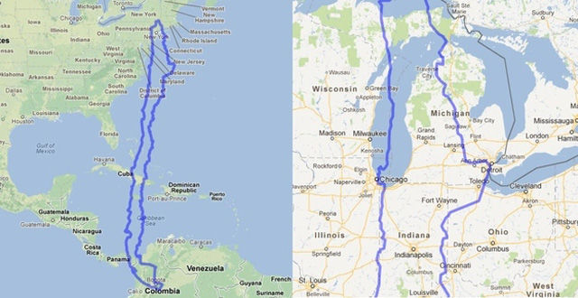
Chile x The United States
Iran x The United States
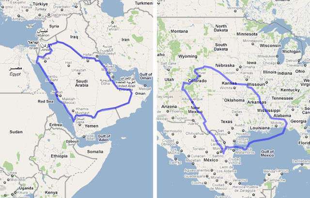
Saudia Arabia x The United States
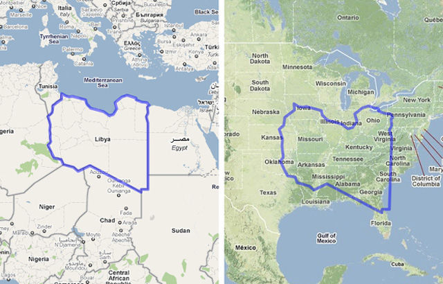
Libya x The United States
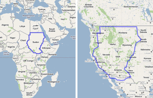
The Sudan* x The United States
*before South Sudan officially became an independent state on July 9th, 2011
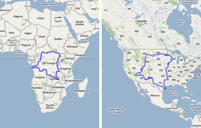
The Democratic Republic of Congo x The United States
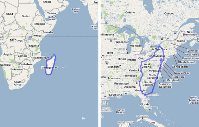
Madagascar x The United States
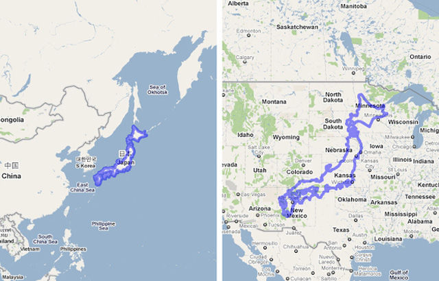
Japan x The United States
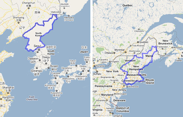
North Korea x The United States
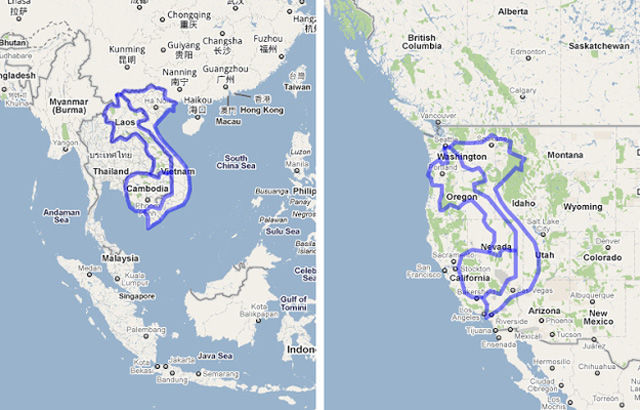
Vietnam, Cambodia and Laos vs The United States
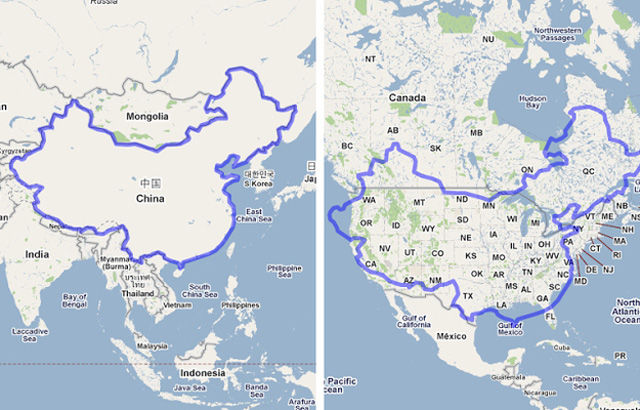
China x The United States
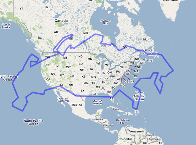
Russia x The United States
India x The United States
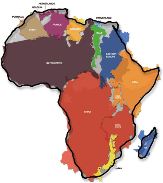
The United States x Africa
The U.S. vs The World
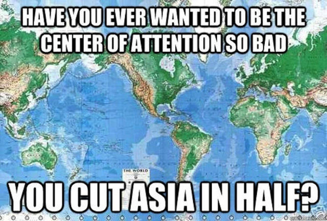
Maps are just all wrong. Here's how the world map should look according to "The West Wing":
Ah, the politics of map design.
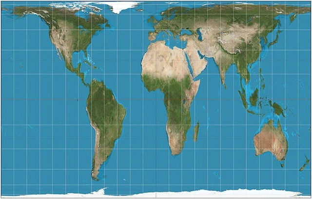
The Gall-Peters Projection world map
While originally created by James Gall in 1885, the Gall-Peters Projection came into public consciousness in 1967 when Arno Peters championed it as a more accurate representation of the size of countries. It was considered controversial for calling into question the way the "third-world" is represented.




What maps do N.A.S.A. use? What do the photographs from space tell us about the placement of our continents?
Well, that escalated quickly.