Peugeot
To our surprise, when Peugeot was created it had nothing to do with automobiles. The brand specialized in steel and blade goods. At that time, the lion logo was used to represent the strength and sharpness of the products the company had to offer.
Unilever
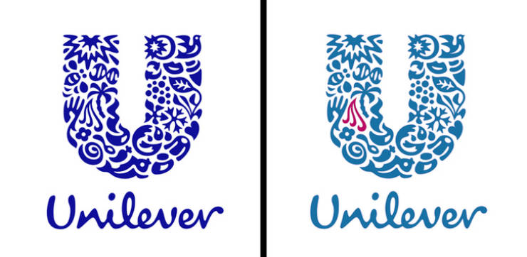
Inside the logo of the gigantic consumer goods company, Unilever, we can see different ways in which they work to improve sustainable living. Each of the 25 icons represents something important to the company. For example, we can see hair which represents beauty, looking good, and feeling confident.
Skoda
The Skoda logo we recognize today was created in 1926. The logo presents an Indian headdress with feathers and an arrow. The origin of the idea is still very mysterious. It’s believed that the logo is a symbol of progress and movement into the future.
NBC
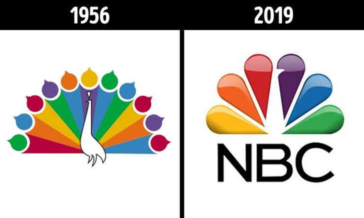
The colorful logo of this popular American broadcasting company is, in fact, an abstract peacock. The brightly colored peacock was created in 1956 to represent the emergence of color programming, hoping to encourage more people to purchase color television sets. NBC was one of the first companies to sell these kinds of sets.
Quiksilver
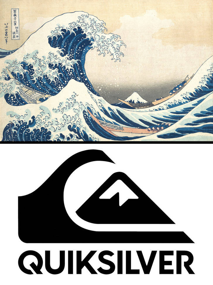
The Quiksilver logo was inspired by the Japanese painter Hokusai’s woodcut work, The Great Wave Off Kanagawa. This logo consists of a typhoon wave and Mount Fuji to symbolize excellence and authenticity.
Roxy
Tostitos
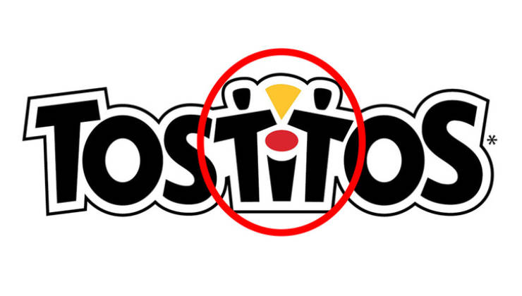
In the middle of the popular tortilla chip brand’s logo we can see 2 people enjoying a Tostitos chip with salsa. It aims to show how this kind of food connects people and brings them together to enjoy good moments.
Museum of London
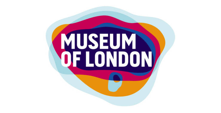
Although the logo looks like nothing more than a collection of colorful, random shapes to outsiders, some Londoners are able to recognize the meaning. The logo represents the geographic area of London over the years as the city grew bigger.
Hershey’s Kisses
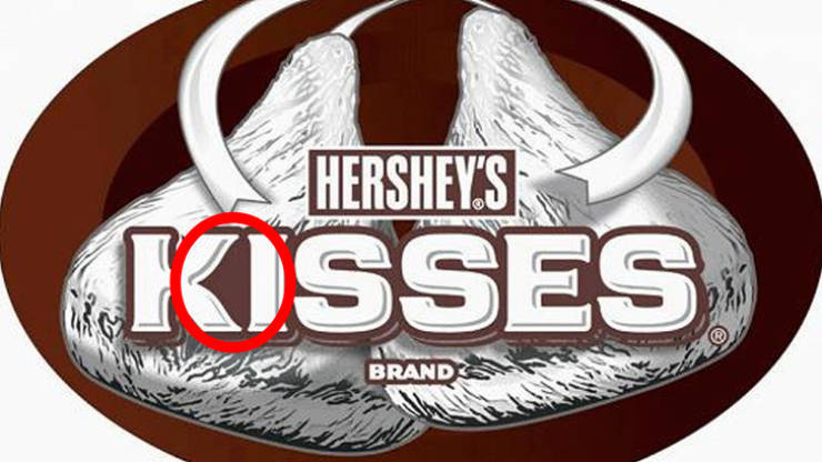
If we look closely at the chocolate brand’s logo, we can see that there’s a Hershey’s Kiss between the letters “K” and “I”, their signature chocolate shape.
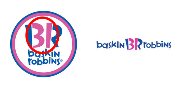
Baskin Robbins
The colors in the famous ice cream chain logo are not just displayed randomly. The parts of the letters in pink represent the 31 flavors of ice cream the brand offers. They proudly display that because when it was created in 1953, it was rare for a company to have that many flavors.

