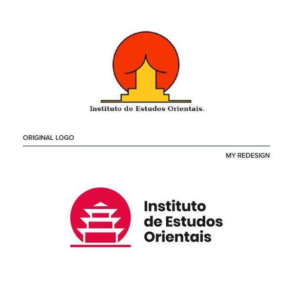
Instituto de Estudos Orientais
This particular case is a great example of a logo with ambiguous message. “I wanted to keep the concept unchanged, working on the negative space and enhancing the figure of the pagoda,” he writes on Behance. Emanuele eliminated the outline for a fresh and modern look. He also aligned the typography with the pictogram and converted the font to sans serif, which “matches the symbol better.”
Emanuele selected 9 of what he thought were the worst logos and rolled up his sleeves. “I was trying to figure out how I would approach them if they were really commissioned to me.” The result is not only fun but also “educational and helps to understand that design is not only aesthetic but, above all, it’s about problem solving.”
The designer believes that the best logos are those “that manage to indelibly enter people’s minds through simplicity and that manage to create an effective and coherent visual ecosystem with the brand they represent.”
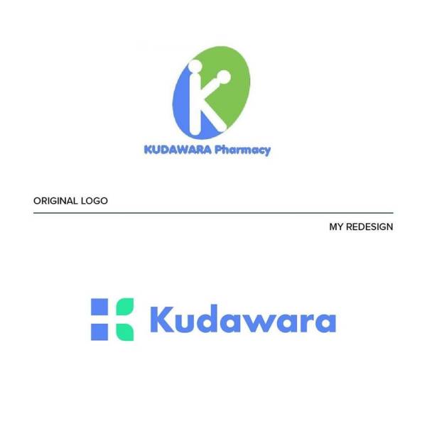
Kudawara Pharmacy
Emanuele believes there are many different problems with this logo. He names a couple of them: “a poor use of typography, disproportionate elements, and the defective use of shapes that creates an ambiguous message.” He said he was ready to delete the whole thing and keep the K as a lettermark only. “I used simple shapes to build the letter K and give a sense of trust linked to nature.” Plus, “In the negative space you can also see a cross (a distinctive element in the pharmaceutical field).”
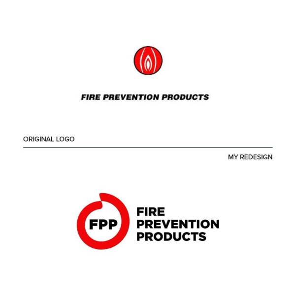
Fire Prevention Products
“This logo suggests that something ‘down there’ is on fire, uh là là!” joked the Italian designer. Of course, it doesn’t hold the sense of safety one would expect. “That’s why I decided to develop a new concept starting from circular shapes that enclose the figure of a flame in the negative space.” The name has been shortened to the acronym “FPP,” which gives the logo great recognition even if the full text isn’t present.
Emanuele said he’s “a big fan of the work of Chermayeff & Geismar & Haviv and I fully agree with their philosophy” because “their logo design projects are the ones that best resist the ‘test of time.'” Such logos should be both simple and unusual enough to look appealing. A good logo should also always “have an interesting concept and be in line with the company identity which it represents,” he commented.
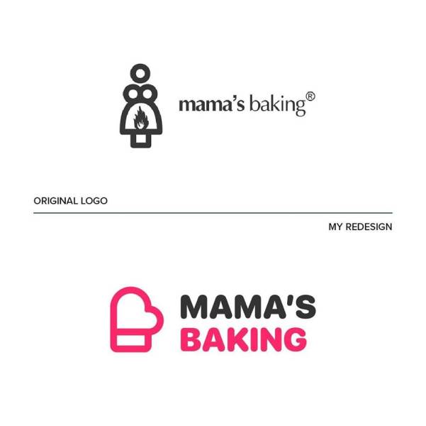
Mama’s Baking
Emanuele has given this logo a whole new concept. The idea was inspired by “the figure of the mother who cooks with passion.” Imagine her taking the hot pan out of the oven. “I started from the oven mitt as an iconic symbol, and tied it with a heart for the message of love and passion.”
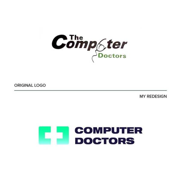
The Computer Doctors
Emanuele dubbed this design so bad that “nothing could be saved of it.” Thus he came up with a new concept that combines the worlds of technology and health care. “The idea behind the new logo was to start from the shape of a monitor to insert a cross in the negative space and at the same time enhance the initial letters C and D,” he explained.
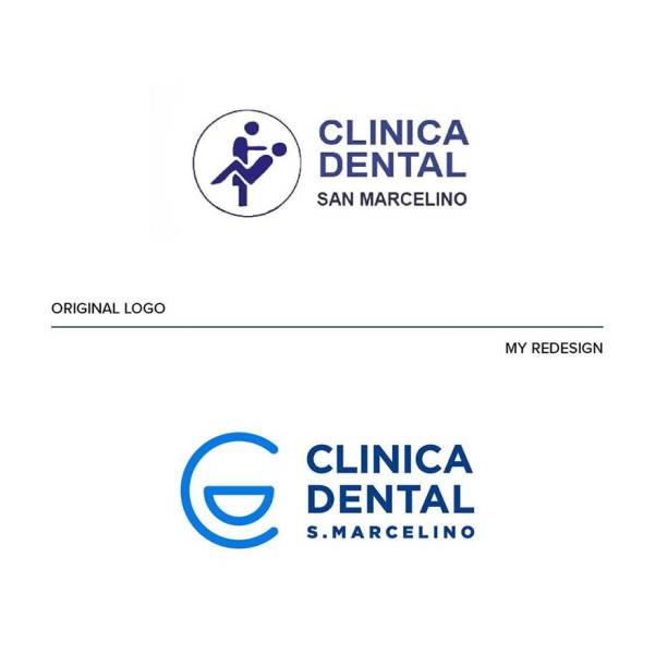
Clinica Dental San Marcelino
“A dentist or a seducer?” That’s what came to Emanuele’s mind when he saw this one. “The logo is so unclear that I came up with a simpler and less descriptive solution.” Thus, he arranged the letters C and D so that they form a smiling face. “The clean, rounded lines and the blue color are intended to convey a sense of confidence and cleanliness,” he commented.
Emanuele currently teaches a course called “Logo Hero” that provides all the education you’d need about logo and brand designs. He also manages “Logofonts” on Instagram, where he reveals what kind of fonts famous logos are using. In fact, “the idea for this page was inspired by the success of my project on Behance.”
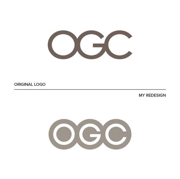
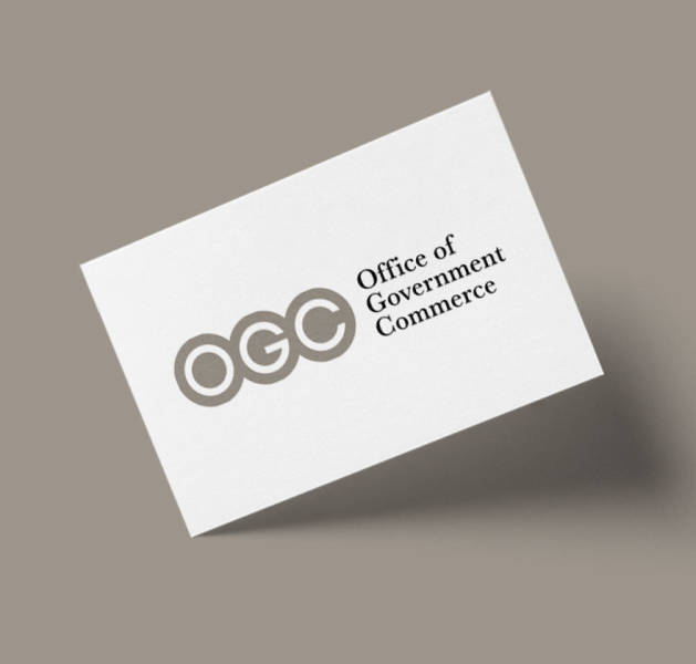
OGC (Office of Government Commerce)
At first, it seems like the original OGC logo has nothing wrong with it. “But by rotating the logo, you can see a rather embarrassing figure (definitely not a good move for a government agency),” explains Emanuele. That’s why he restyled the logo by enhancing the letters, eliminating the outline and giving it a modern look.
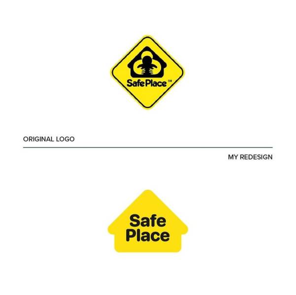
Safe Place
This case has just too much going on: “It’s all shapes inside shapes inside other shapes.” Emanuele rolled up his sleeves: “Ok, let’s do some tidying up, let’s take away everything that is superfluous: the house is the only really evocative element of this logo and so, let’s enhance it!”
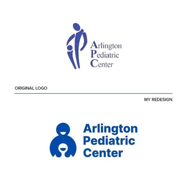
Arlington Pediatric Center
The new logo starts with the same concept, but it’s more confident. “The simple and circular shapes make the pictogram friendly and warm. I also replaced the typography with more modern but still institutional sans serif.”





true dat.
To be fair it does say Arlington. As in Arlington Massachusetts a leftist stronghold. Nambla members and spirit cookers all over if you know what I mean. So it really not surprising that the man-boy love keeps shiny through.
Quote:-"
Area codes 347, 718, 917 and 929 serve the New York boroughs of The Bronx, Brooklyn, New York City, Queens, and Staten Island and the Marble Hill area of Manhattan due to its physically proximity to the Bronx." - end quote.
what does the National Association of Marlon Brando Look Alikes have to do with anything?
its literally redesigned alternation of original logo of "safe place"
I was wondering about that.
Can he copyright his logos and then offer them to the companys after they got traction on the Web?
their intellectual property is covered automatically, if the companies used them or something deemed close enough to potentially cause confusion then they would be open to litigation, you can submit them to various places depending what country you're in also for extra protection, or you could copywrite them, but thats probably overkill
A little west of there. Our local police chief was caught trying to meet an under age boy recently. The secrets of the elite and their control matrix are dark indeed. How many small town Gothicas do we have? Lots! How deeply is the unhinged “tolerant” left involved in all this horror? Well it’s pretty much out in the open and they are trying to normalize it! The number of Tom Hanks avatars on this site is disturbing not to mention the stuff that disappeared, and that’s just the tip of the ice berg...