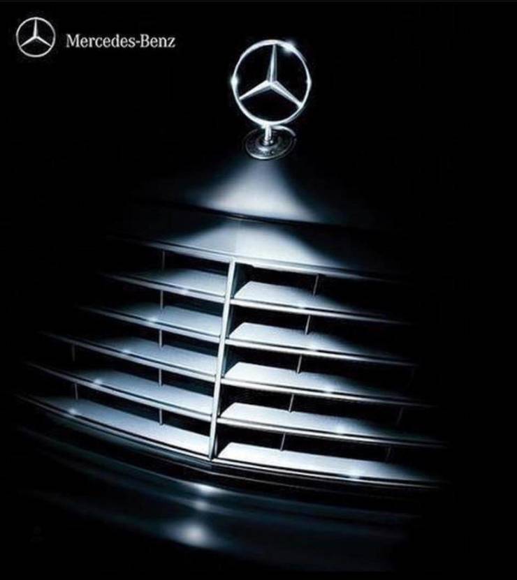
"This Mercedes Christmas ad"
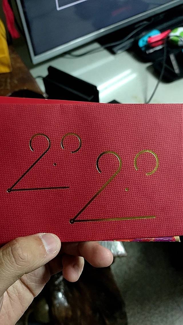
"2020 is the year of Mouse, this is the best red envelope design I've ever seen"
"New Iceland sports team logo depicts the four mythological protectors of the country. Landvættir."
"This unbelievably creative logo!"
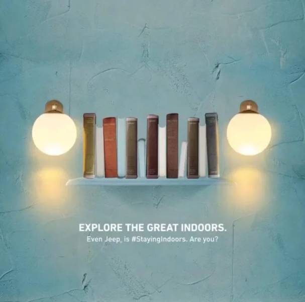
"Jeep: Explore the Great Indoors"
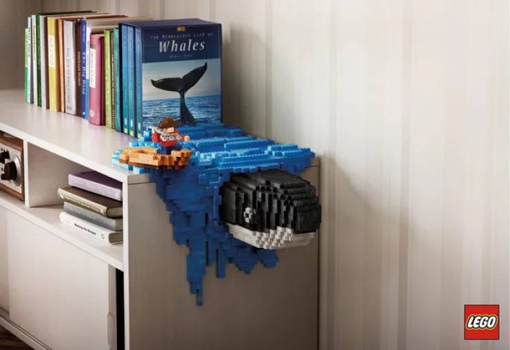
"LEGO Advertisement"
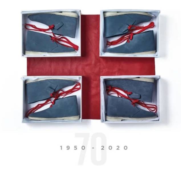
"This ad for the British shoe maker Clarks."
"Elevator Kick Buttons"
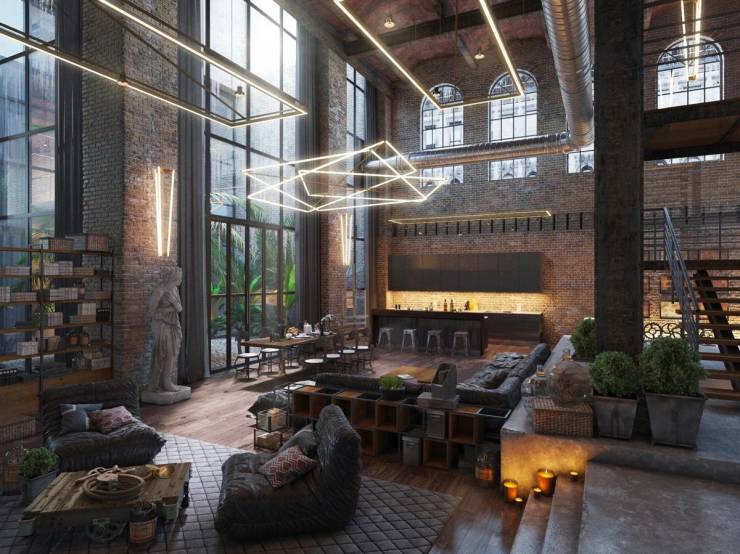
"Turning industrial loft into living quarters"
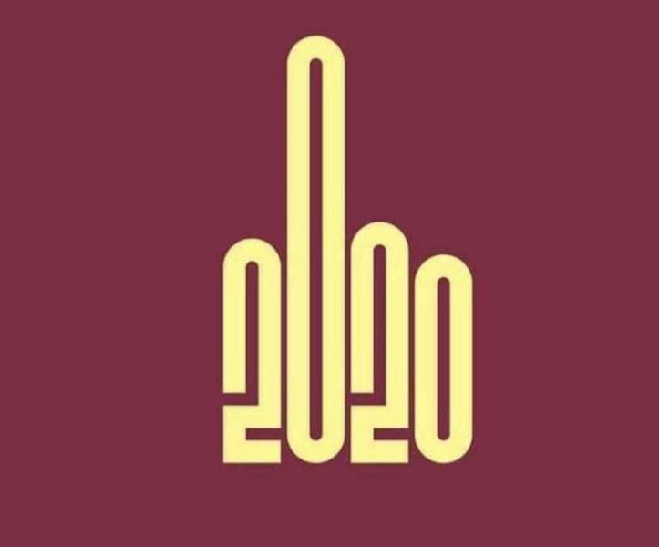
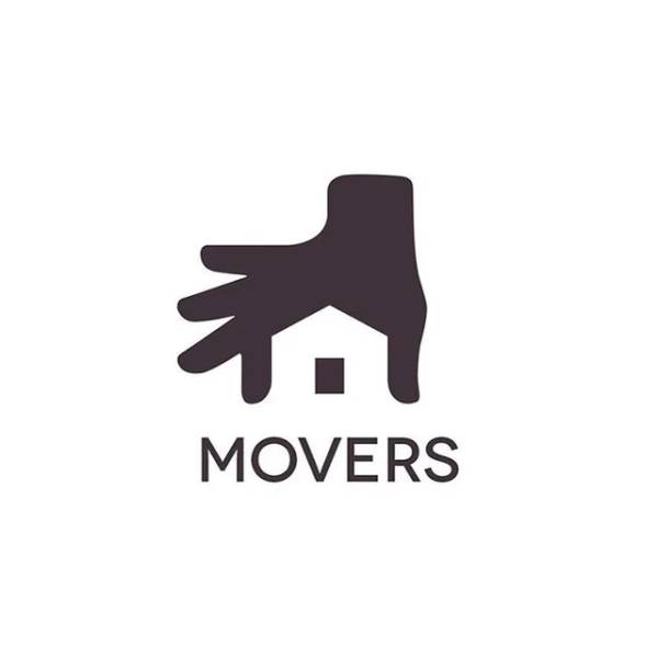
"Literally the logo of the year"
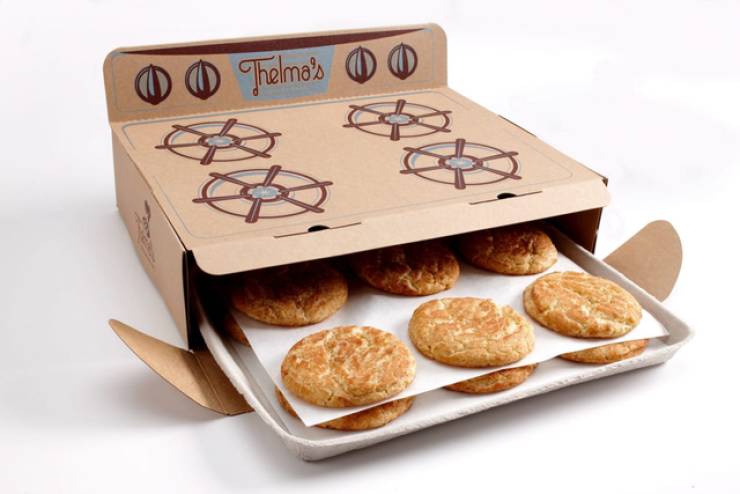
"Cookie Packaging"
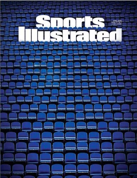
"This cover from Sports Illustrated"
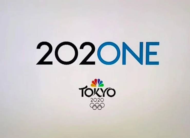
"Tokyo Olympics"
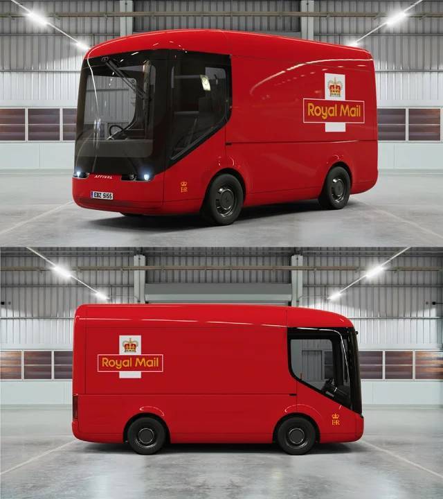
"Royal Mail's new electric delivery van is just the cutest"
"This swimming pool ceiling"
"This logo."
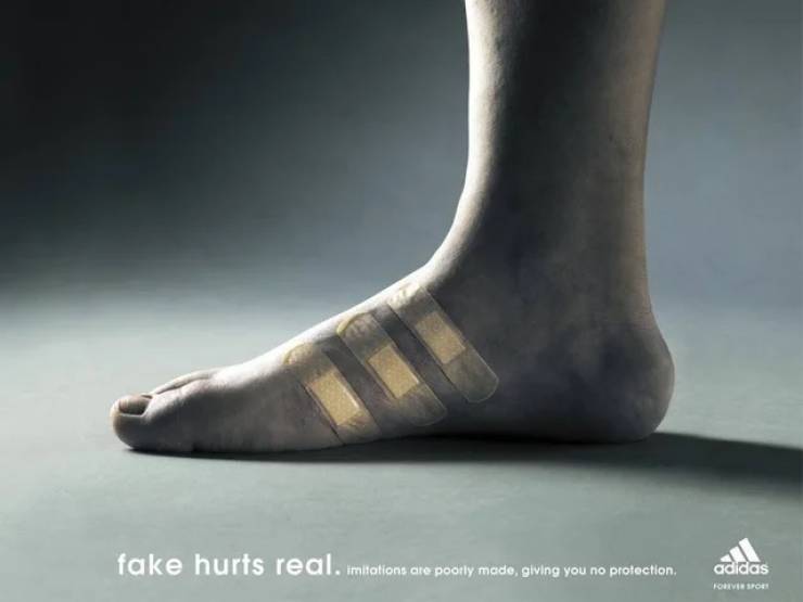
"Adidas campaign for fake shoes!"
"This ashtray picturing the damage of smoking"
"1920s perfume holder"
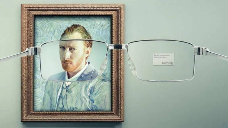
"Ad for an eyewear company"
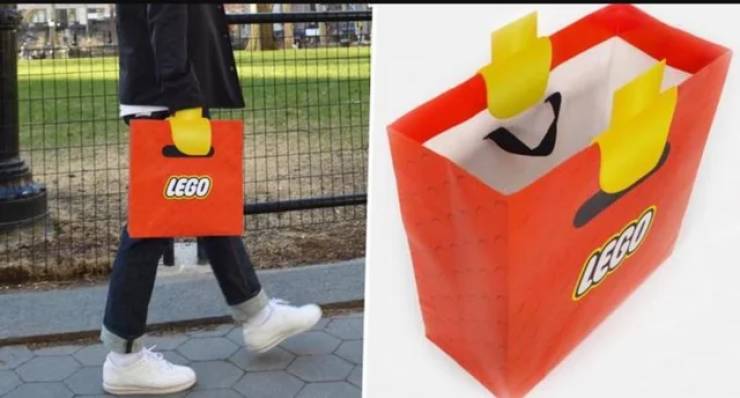
"This Lego bag makes it look like you have Lego hands"
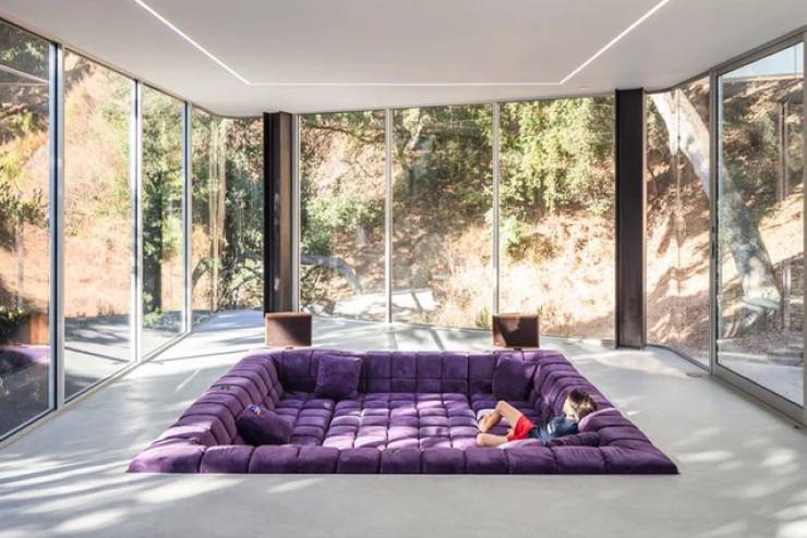
"A sofa that makes you want to dive into it"
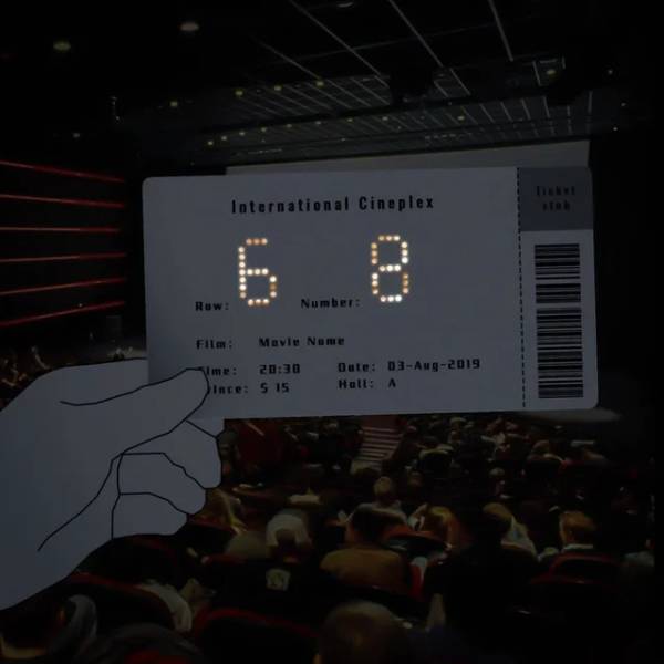
"Hole punched cinema ticket that shows row and seat number in the dark, designed by Li Peitong"
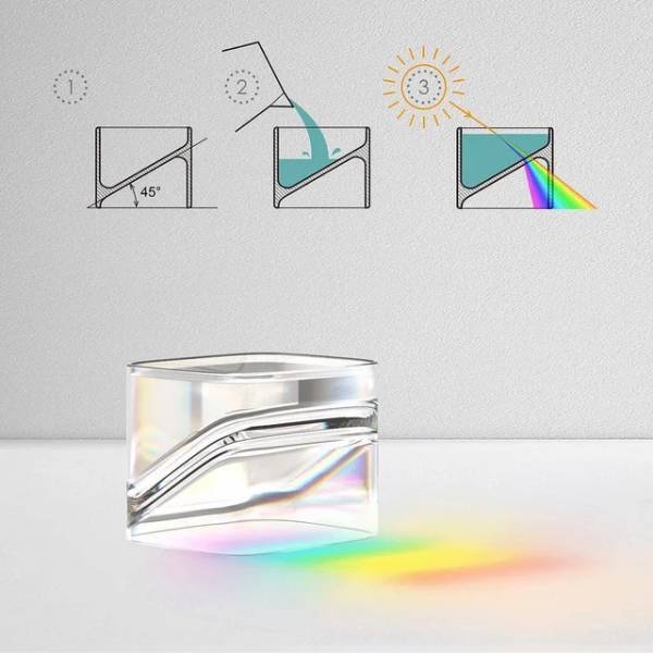
"Artistic twist on glassware"
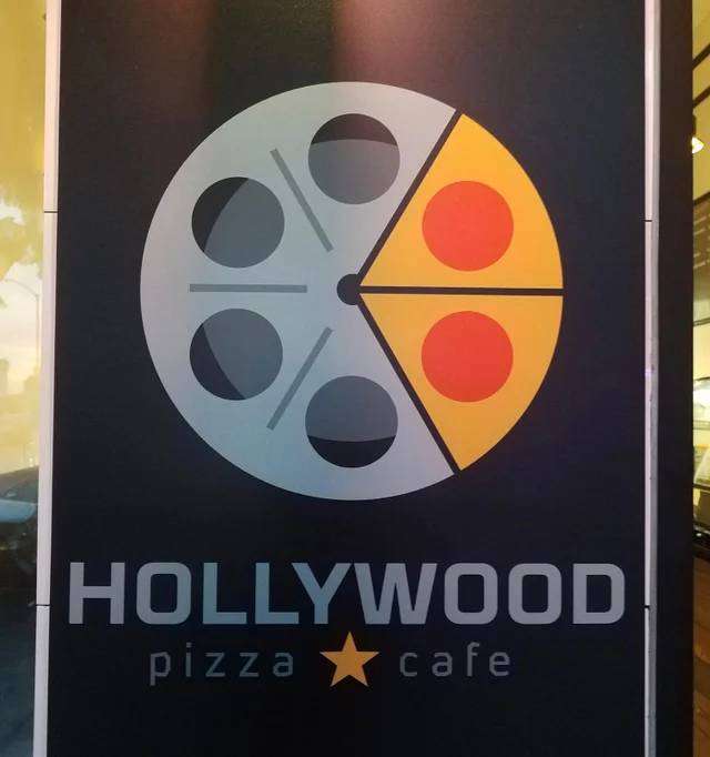
"Pizza place on Hollywood Blvd."
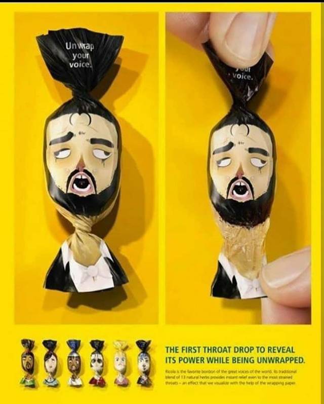
"This throat relief drop wrapper"
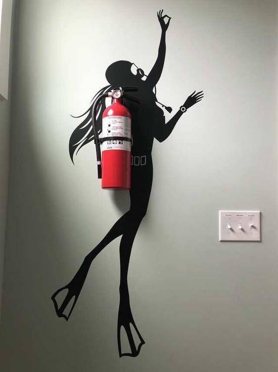
"This fire extinguisher art"
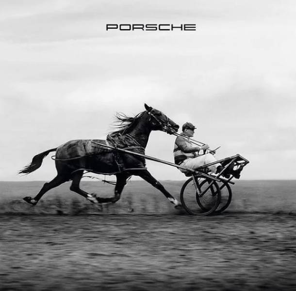
"This Porsche ad (for those who dont know the engine is in the back of most Porsche)"
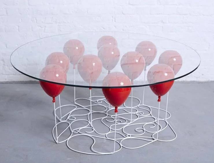
"Balloon Table"
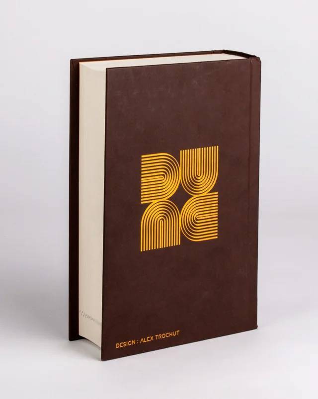
"Back cover of Dune. Turn it and it always says DUNE. Design by Alex Trochut"
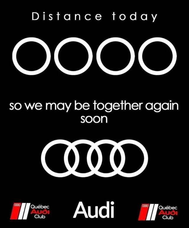
"I’ve seen quite a few companies redesign their logos, but this is the first I’ve seen Audi’s"
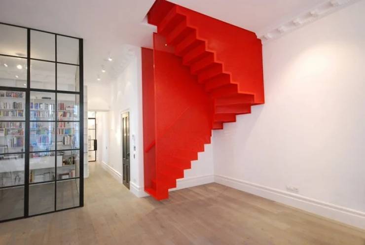
"Yet another way to comprehend stair space."
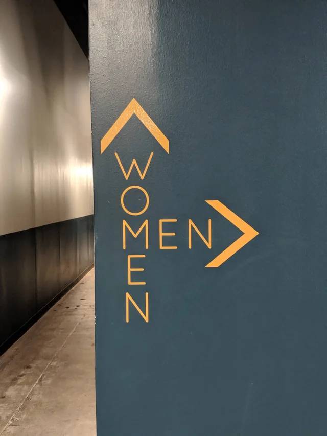
"This Bathroom Direction Sign"
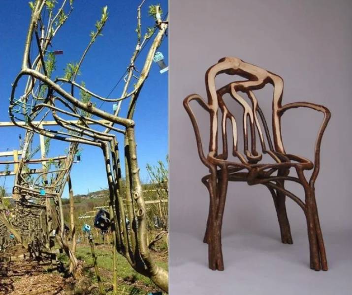
"Designing furniture on growing trees by strategic sculpting and grafting"
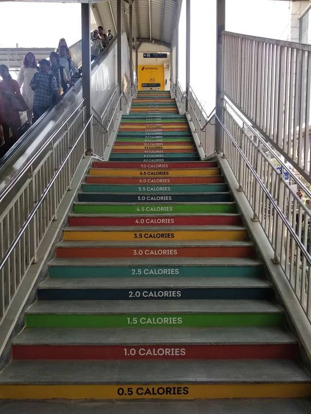
"A staircase at a metro in Hyderabad, India"
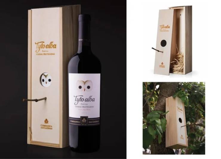
"The wine box that is reused as a birdhouse"
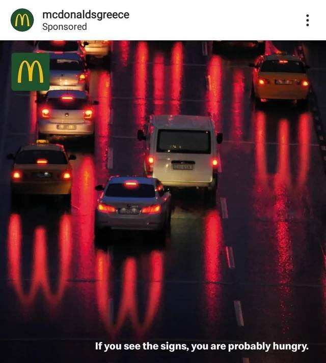
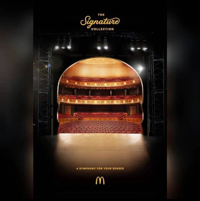
"This McDonald's ad I came across"
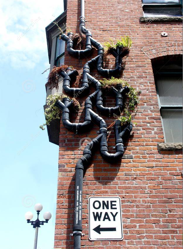
"This downspout with vertical garden attached in Seattle."
"McDonald's Germany's campaign announcing their new range of Signature premium burgers."

