Charts That Make Complex Information Crystal Clear (37 PICS)

Posted in INTERESTING       10 Jul 2023       7505       8 GALLERY VIEW
Pages  1/2

"How Different Piano Notes Reverberate Through A Bowl Of Water"

"U.S. Flag But Each Star Is Scaled Proportionally To Their State’s Population, In Roughly It’s Geographical Position"

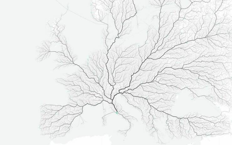
"European Roads To Rome"

"Long Exposure Of A Roomba Vacuum With A Color Changing Light On Top"

Izismile Videos

"Paths Of 800 Unmanned Bicycles Being Pushed Until They Fall Over"

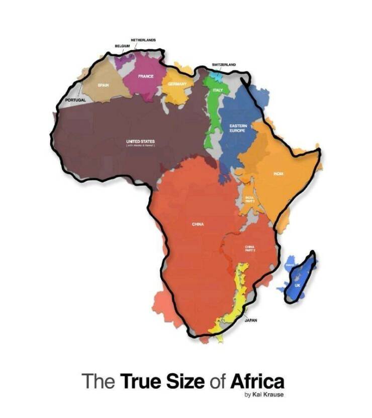
"All These Countries Fit Inside Africa"

Advertisement

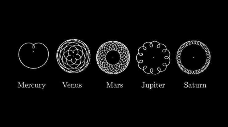
"These Diagrams Show The Paths Traced By Mercury, Venus, Mars, Jupiter And Saturn As Seen From Earth"

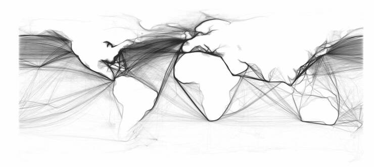
"This Map Is Drawn Entirely From Shipping Logs From 1945"

Advertisement

"My Wife Made This Blanket That Indicates A Certain Temperature For Every Day Of The Year. 2016 Pennsylvania"

"I Rendered Every Single Road In Tokyo Area On One Map. Love The Results"

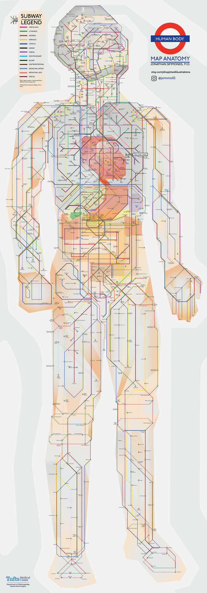
"Anatomy Of The Human Body, In The Style Of The London Underground Map"

"Smarties Colour Distribution"

Advertisement

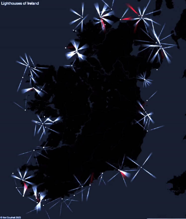
"Every Lighthouse In Ireland, With Accurate Timings, Flash Patterns And Colours"

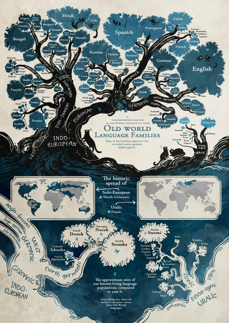
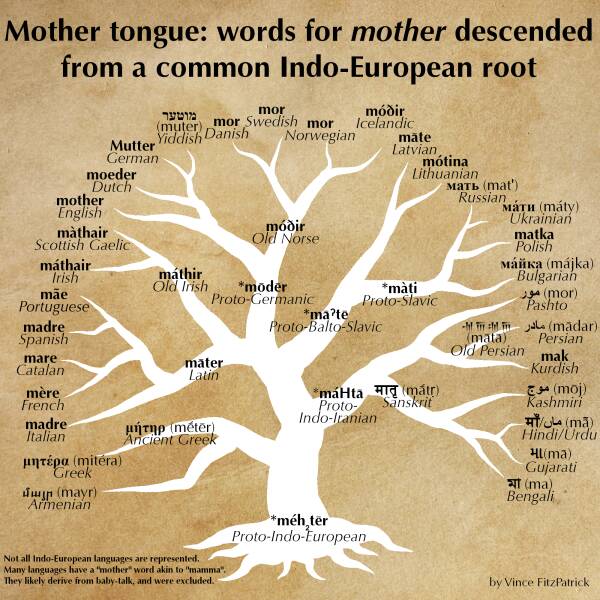
"Words For "Mother" Descended From A Common Proto-Indo-European Root"

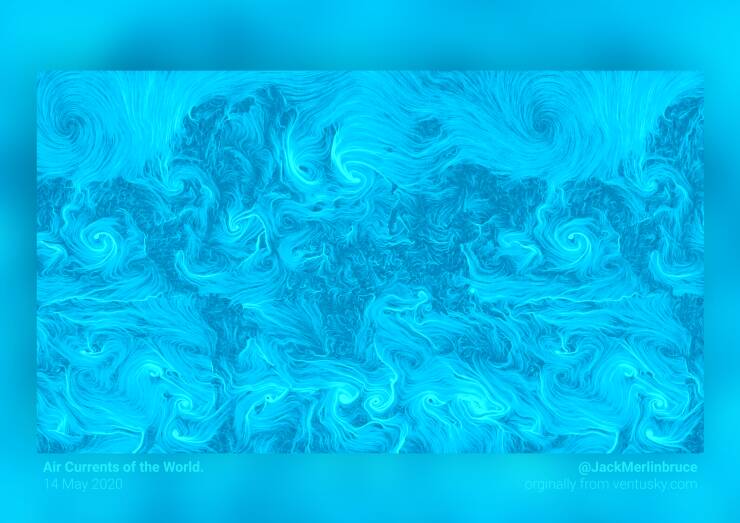
"This World Map Is Made Of Only Air Currents. If You Look Closely, You'll See Country Outlines"


Advertisement

Pages  1/2

Credits:  www.reddit.com


8   Comments ?
2
1.
Del 1 year ago
#31 They used HadCRUt, the most poorly sourced data sets available. Do one for UAH or even RSS.
       
2
2.
Leet 1 year ago
#7 Didn't think the spreading would look that symmetrical 36
       
4
3.
Emanuel 1 year ago
#32 You could do the same for daily temperature in Boston from Jan 1 to July 1. It's meaningless unless you understand the entire cyclic pattern.
       
1
4.
Lecurgus 1 year ago
#8 I don’t get it, what is the current fascination with fitting a bunch of countries into the African continent. It’s an apple to apple seed comparison. Let’s just fit all continents into the Pacific Ocean.
       
3
5.
Bennie 1 year ago
Lecurgus,

it's about the most commonly used map projections that show Africa the size of two USAs or something. Fitting countries/continents into Africa shows the true scale of the continent, not the one internalised by everyone.

Also, I don't think it's "current"
       
0
6.
Sibbie 1 year ago
#30 and average is above average.
       
1
7.
Shaina 1 year ago
#4 It missed a lot of areas.
       
-1
8.
Shaina 1 year ago
#8 So what?
       
27353641acute
belayclappingdance3dashdirol
drinksfoolgirl_craygirl_devilgirl_witch
goodgreenheartJC-LOLJC_doubledown
JC_OMG_signkisslaughingman_in_lmocking
mr47_04musicokroflsarcastic
sm_80tonguevishenka_33vomitwassat
yahooshoot
Advertisement


Advertisement


Advertisement

Archives

2023
2022
2021
2020
2019
2018
2017
2016
2015
2014
2013
2012
2011
2010
2009
2008
0000
Advertisement


How to comment

•    Don't insult other visitors. Offensive comments will be deleted without warning.

•    Comments are accepted in English only.

•    No swearing words in comments, otherwise such comments will be censored.

•    Your nickname and avatar are randomly selected. If you don't post comments for 7 days, they both are reset.

•    To choose another avatar, click the ‘Random avatar’ link.

random_banner_2