–
Some people are clearly paid too much for what they come up with… Anyway, this list has its share of surprises.
–
Posted in
13 Jul 2012
13424
–
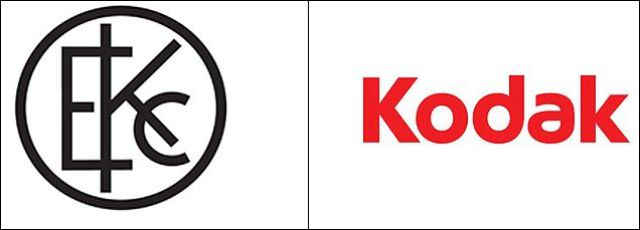
Peer back in time to see how these recognizable brands have changed their logos and see what their future logos could become.
–
Posted in
6 Oct 2011
25590
–
Posted in
21 Sep 2011
23174
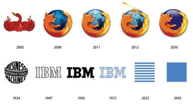
We all know the looks of well-known logos in the past and present. But we have no idea what they will be like in the future. Let’s pretend it is future now.
–
These are what some well known logos would say if they were honest. Of course, honest logos wouldn’t help sell their products, now would they?
–
Posted in
27 May 2011
24844
Only such creative and elegant logos that you’ll see inside this post help companies to really stand out and be remembered by customers. These are some incredibly clever ideas!
–
Artist Viktor Hertz created these alternative logos for his project “Honest logos” whereby he humorously conveys the true purpose behind these companies. I haven’t seen too many cat videos on YouTube but plenty of laughing babies.
–
This is a great collection of smart logos with the hidden message.
Some, of course, are obvious, but some, to fully understand them, you need to the story or explanation, or even a little puzzle. For me, these are the best logos in terms of design.
Yoga Australia
Woman is making a pose that forms the Australian continent between her leg and her arm.
–
The photos in this post are of real logos that fail but are naughty and uproariously funny at the same time. Whether they were made intentionally naughty or not remains a subject for debate, but that is exactly what makes them so funny.
–
Just a funny series of Google logos which show their designer is having marital problems… ))
Funny and well found!
–
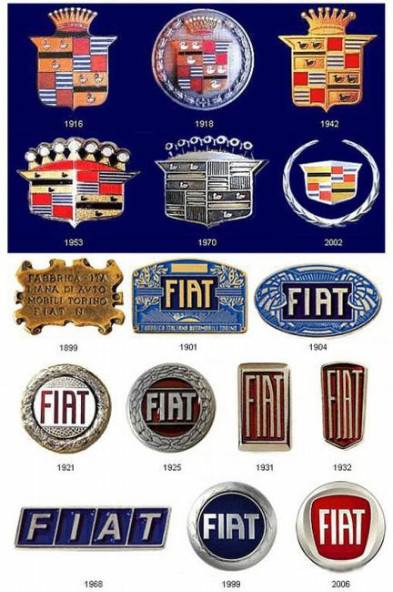
It’s a great series about the evolution of logos of brands, from Ford to Nokia and many others…
It’s very interesting to see how it evolved.
–
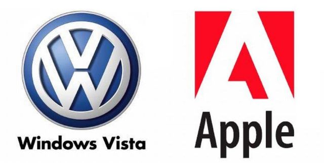
When Volkswagen meets Windows Vista or when Adobe meets Apple… ))
Here is a nice compilation of logo mashups that you should easily recognize.
–
Here is the description of the site: “Logo.Hallucination proposes to use technologies of recognition of images in order to detect subliminal forms of logos or emblems, hidden (generally involuntarily) in the visual environment or in the whole of the images of the Internet. The found images will be accessible in a weblog, proposing a comparison between the original on the one hand and, on the other hand, the brand and its logo.”
I must say that the results are interesting, some comparisons are funny but the majority, if not all, are really twisted. I would not have even seen a single brand (its logo) by myself, even if I had searched for days…
You will find more info on the author’s website.
–
Look at these logos. Don’t they look almost the same to you?
I think the more time passes the more difficult it becomes to come up with some original design that would be unique and wouldn’t resemble to any other.
The examples inside the post are a good way to see it. Ametek and Axis Bank

Applied Materials and Planned Parenthood

Bank of Amercia and Amtrak
–
Russian photoshoppers from leprosorium.ru made a great photomontage with world known logos of the famous brands to show how they “could act if they were not printed objects but real life creatures”.
Let’s see what did they come up with.

