–
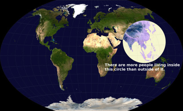
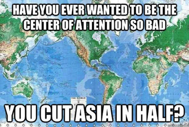
These maps will give you a better understanding of the United States in relation to the rest of the world.
–
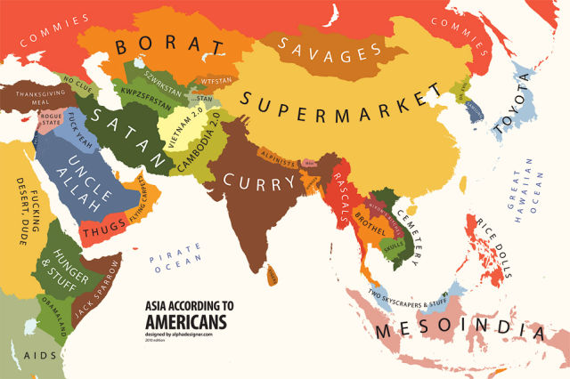
The graphic artist Yanko Tsvetkov created these funny maps of Europe and the world based on a variety of stubborn stereotypes.
–
Posted in
VIDEO 2 Apr 2012
5774
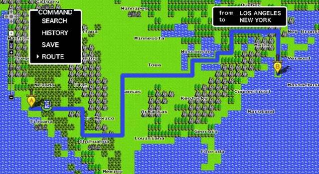
Begin your quest here. Note that the Google Street function is also altered in a cool way. They really put a lot of efforts in this April Fools 2012.
00:00
–
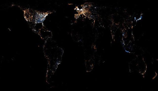
The maps of give a perception of how Twitter and Flickr re used worldwide and where they are used the most. These activity maps show the dots of different colors. The blue dots are tweets, the ornage ones – Flickr and the white dots are both - tweeted and uploaded to Flickr.
–
Posted in
2 Apr 2011
14889
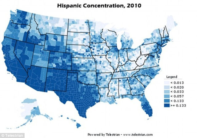
Learn more about US demographics with these eye-opening maps that break down population shifts and racial and political changes throughout the country. One thing is for certain, major population changes are happening in the US.
Hispanic concentration:
–
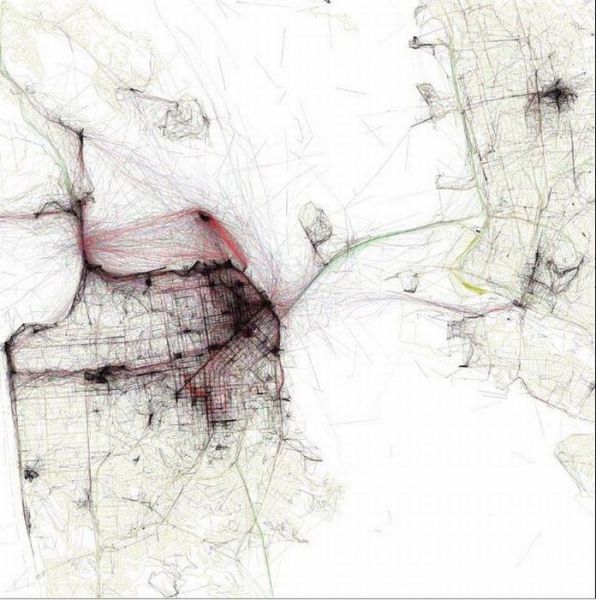
These are aerial maps of various large cities. What is interesting about them is that they are taken in accordance with the number of photos that were taken by tourists. The most black color in the photos represent where the most photos were taken.
San Francisco
–
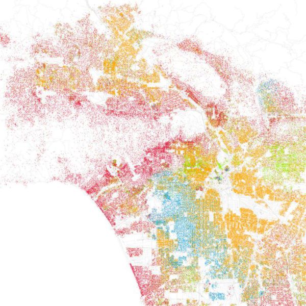
These maps are an interesting project that was developed by Eric Fischer. The maps show the population of various American cities by race and ethnicity, which are color-coded. Here’s what the colors stand for: Orange represent Hispanic population, Red is White, Blue is Black, green – Asian, Grey is other and each dot represents 25 people.. Really interesting and informative.
Los Angeles

